We all know that making hit movies costs a huge amount of money. But what we don't tend to think about is that getting people to come to a movie, with trailers and posters, is often just as expensive.
A studio might spend as much as it cost to actually make a blockbuster film again on marketing it - sometimes hundreds of millions of dollars.
ItŌĆÖs vital then the posters they design manage to convince us to go out and buy a ticket. The problem for the studios is that we might only glance at a movie poster for a few seconds, but in that time it has to tell us what kind of movie it is, what makes it special and why we have to see it.
Film journalist and critic Adam Smith tells us of some of the tricks studios have up their sleeves to make sure the posters do just that.
Use blue on black for action
Think about bags of crisps. Red means ready salted, right? Green, very likely to be cheese and onion. Blue, the all-time classic, salt and vinegar. You donŌĆÖt really need to see much more than the colour of the pack to immediately know whatŌĆÖs inside.
The designers of movie posters use the same secret colour codes for movies. Blue on a black background is the go-to colour scheme for action movies, usually with a vivid splash of orange in the form of fire.
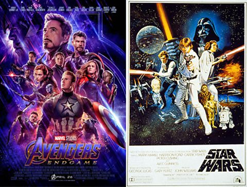
The colour schemes used on the posters for Star Wars and Avengers: Endgame are incredibly similar, despite the movies being made over 40 years apart (as is the way the characters, and gunfire, are arranged, more on that next).
Without reading anything on the poster, the colours alone tell you what kind of film to expect.
Mirror another hit movie posterŌĆÖs composition
If a poster has worked for one movie you can see subsequent ones ŌĆśborrowŌĆÖ elements of it to try to subliminally convince people that liked the first to try the second.
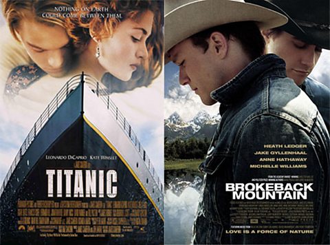
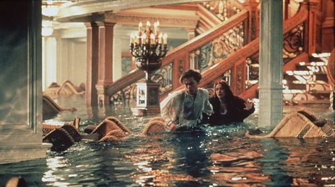
Take the above posters for James CameronŌĆÖs smash hit Titanic and James SchamusŌĆÖs Brokeback Mountain. You can immediately see the similarities in the composition (the way the different objects are arranged on the poster), which is probably not a coincidence. The charactersŌĆÖ heads are in the same position, both on the posters (at the top) and in relation to each other (one bowed in profile and the other looking down but facing us).
The title of the film is in the same place, both use clouds and soft light and the muted, washed-out blue colour schemes are similar (which implies heritage and period, both movies are set in the past).
The effect is to secretly say: ŌĆ£If you liked that historical, tear-jerking story about a doomed love affair, you might like this one as well.ŌĆØ
Yellow means indie
Smaller films have to quickly catch the attention of indie movie fans amidst the hubbub of the marketing campaigns for the gargantuan blockbusters. So designers have set upon using yellow as a secret ŌĆścodeŌĆÖ colour for indie movies.
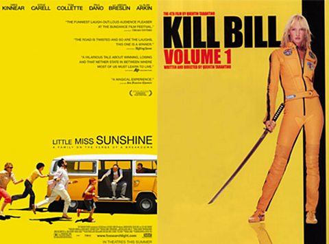
Quentin TarantinoŌĆÖs violent revenge fantasy Kill Bill, family comedy Little Miss Sunshine and racing documentary Senna couldnŌĆÖt be more different in terms of their subject matter.
But they were all indie movies, trying to attract an audience interested in smaller films rather than the big blockbusters. The bold, unmissable use of yellow makes the poster stand out, and communicates the kind of audience itŌĆÖs intended for, without them having to even read the title.
The tagline
The tagline is the short sentence that sums up the film and tries to convince you that you need to see it. These are the only words a poster has to communicate a vast amount of information.
Taglines are an art-from all of their own and copywriters spend a great deal of time honing them to perfection. Some become famous, like Jaws 2ŌĆÖs: ŌĆ£Just when you thought it was safe to go back in the water.ŌĆØ
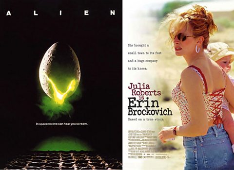
Some taglines work by asking an intriguing ŌĆśinvisibleŌĆÖ question, one that only seeing the movie can answer. Take Ridley ScottŌĆÖs Alien and its all-time classic tagline: ŌĆ£In space no-one can hear you scream.ŌĆØ The word ŌĆ£screamŌĆØ indicates a scary movie, but why would you be screaming? YouŌĆÖll have to go and see the movie to find out.
Others try to sum up the whole message or mood of the movie. Erin BrockovichŌĆÖs ŌĆ£She brought a small town to its feet and a huge company to its kneesŌĆØ gets a huge amount of information about the film into just 15 words.
Taglines are the only words a movie poster has, so they have to say a lot. They need to work hard and fast.
Red, black and a white background means comedy
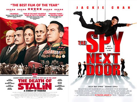
Quickly communicating a film is a comedy is a tricky thing to do. A gun in a poster image says itŌĆÖs a thriller or action movie. Blood or a vampireŌĆÖs teeth that itŌĆÖs a horror movie. But thereŌĆÖs no single object or clue that you can put in a poster to scream ŌĆ£funny!ŌĆØ.
ThatŌĆÖs why movie poster designers very often use the code of bold red and black on a white background to sell the idea that a film is a comedy. Red is a colour often associated with comedy (think Red Nose Day) while, according to movie poster designer James Verdesoto, the white background focuses the attention on the characters, the source of the humour in a comedy film.
As mentioned earlier, itŌĆÖs a colour scheme thatŌĆÖs become embedded in moviegoers minds as deeply as ŌĆ£green is for cheese and onion.ŌĆØ
Harness the power of nothing
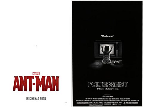
YouŌĆÖd think that any movie poster designer would want to make the image as big as possible for maximum impact. But in fact sometimes reducing the size of the main image and surrounding it with a lot of nothing (negative space is the designersŌĆÖ term) can really draw your eye to what the designer wants you to see. ItŌĆÖs often used as way to make you think about the theme of the movie.
Saul Bass was one of the great graphic designers of the 20th century and his poster for 1955ŌĆÖs Anatomy Of A Murder uses negative space to draw the eye to his clever design of the title of the film. The poster for classic horror film Poltergeist puts little Heather OŌĆÖRourke in a sea of darkness. What could be lurking there?
But the record for using negative space must go to MarvelŌĆÖs Ant Man. When you do see the tiny image it might make you smile. Tiny things can make a big impact, which is, of course, the point of the film.
Six blockbuster films that got history wrong
From Bohemian Rhapsody to Titanic, movie-makers have been very creative with historical timelines.
When film and TV got the future spot-on
The storytellers who predicted President Trump and the technology we have today.
Years of fears: How horror films keep us on the hook
We look at how horror films have changed to keep us screaming.