Asymmetry
Compositions do not need to be completely symmetrical to appear balanced.
Asymmetrical balance can be created through careful arrangement of visual weight within a work of art or design. Asymmetry gives the artist or designer a greater range of freedom and can be used to create more interesting and varied work.

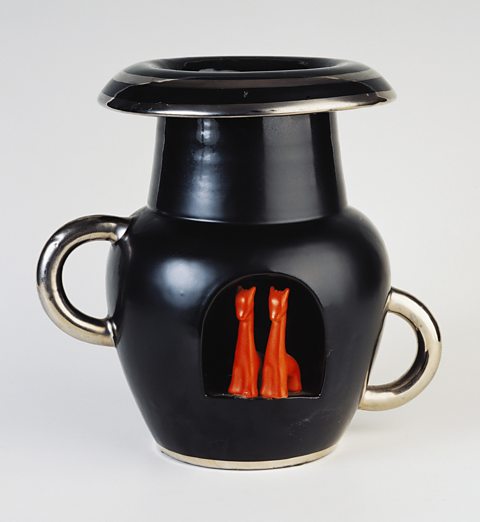
While the body of this vase (Deruta, Italy, 1935) is symmetrical, the different positions of the handles makes the design asymmetrical.
The handle on the left is higher up and further from the centre of the vase. This gives it more visual weight than the handle on the right.
This is balanced by the red forms that sit just to the left of the centre line. The final composition is more interesting than a symmetrical arrangement of these elements but the vase still appears stable.


Asymmetrical balance has been used in this woodcutA print made using a design that is cut into the surface of a wooden plate., The Sea at Satta in Suruga Province (Utagawa Hiroshige, 1858).
Visual weight on the left of frame comes from the cliff, the detailed texture of the branches and leaves and from the larger but simpler shape of Mount Fuji in the distance.
This is balanced by the breaking wave and rocks on the right. Although the composition is not symmetrical, the use of similar shapes, sizes and levels of detail keeps the visual weights balanced.


Avenue of Schloss Kammer Park (Gustav Klimt, 1912) shows asymmetry in the placement of the building at the end of the avenue of trees.
The large area of highly detailed and textured dark greens and blues of the trees is balanced by the smaller, less detailed but brighter yellow front of the building.
The angled avenue of trees draws our eye, providing the viewer with a more engaging and visually dynamic route towards the focal point in the distance.


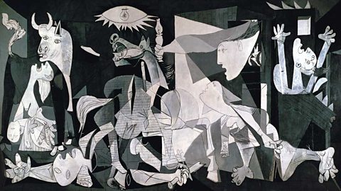
Guernica (Pablo Picasso, 1937) shows a BasqueRelating to the Basque Country in the north of Spain and south of France and the indigenous people of this distinctive area and culture. town being bombed during the Spanish Civil WarWar that took place in Spain between 1936 and 1939 between the democratic, leftist Republican government and the more conservative Nationalists.. At first the composition appears disordered and chaotic but PicassoÔÇÖs painting is carefully balanced:
- the central mass of figures is organised into a symmetrical triangle
- the dark background behind the horse is balanced by the light background created by the open door
- the woman and bull to the left of frame are balanced by the woman with raised arms on the right
- the arm in the bottom left corner is balanced by the leg in the bottom right.
Question
How can visual weight be used to make an asymmetrical artwork balanced?
The use of similar shapes, sizes colours and detail on either side of a piece can achieve balance even if the arrangement of these is asymmetrical.