Statistics
Statistical diagrams
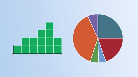
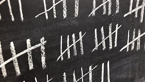
Statistical information can be presented through constructing, interpreting and comparing diagrams.

Comparing data sets
Data sets can be compared by looking at their similarities and differences. This can be done by first calculating an average and a measure of spread for reach.

Scatter graphs
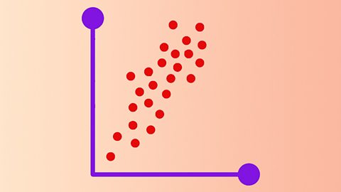
Scatter graphs are a visual way of showing if there is a connection between groups of data. If there is a strong connection or correlation, a ãline of best fitã can be drawn.

Video playlist
Mean, median and mode. Video
An animated guide to mean, median and mode which demonstrates that these different types of average can produce very different results.

The Approximate History of Probability. Video
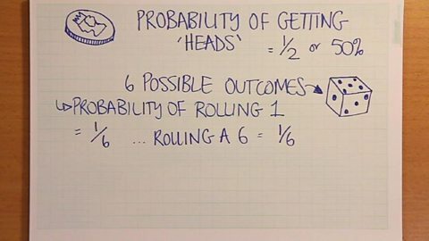
An animated look at probability in maths.

Bitesize maths: Probability. Video
An animated guide to probability.

Links
- External linkExternal link
- External linkExternal link
- External linkExternal link
- External linkExternal link