Being a part of an in-house service design team in the ´óĎó´«Ă˝ comes with a lot of perks. I get to work on many complex and exciting projects, with a wide range of stakeholders. Every project is an opportunity to explore something new.
Sometime last year, our team started to work on a big service design project. When scaling up one particular part of the service to accommodate the dynamic needs of various users, things got complicated. The list of scenarios, users, and tasks kept on growing, and the shared understanding of them was not catching up.
I'm happy to say that after many conversations, several workshops and a pile of sketches, we solved the problem.
On top of that, we also created a new service design mapping technique. It has been trialled by other members of the team and used for other service design projects over the past few months. The feedback from the team and our stakeholders has been very positive.
The new technique is called lifecycle mapping.
What is lifecycle mapping?
Lifecycle mapping is a simple, yet effective method to show how a service supports its users through a specific task. It generates a map that illustrates the lifecycle of a task, including the stages within the task, the actors involved, the options they have, and the impact their actions bring.
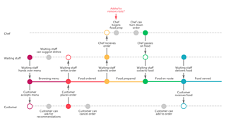
When designing for a service, we often design for users from both the front stage and the back stage. Illustrating what they can do, and how their actions are tied together is essential, but can get complicated very quickly.
Lifecycle mapping keeps it simple. It is about maintaining a human-centered perspective. Through it all stakeholders can come together, to design and deliver a service that supports every user involved doing what they need to do.
It works especially well illustrating tasks that have various stages, and can be affected by different actors. For example, you would not need a lifecycle map to show how eggs are taken out of a fridge. But having a lifecycle map that illustrates how scrambled eggs are ordered, made and served in a restaurant would be quite useful.
How is it different from a journey map?
A journey map captures what the user do, think and feel, and what they are interacting with over time. It tells you what they went through. Like a story, it comes with a narrative, and the highs and the lows of users' emotion too.
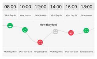
A lifecycle diagram focuses on a particular task people do, the actions they take, and other actors involved along the process. Though it highlights the interactions, as the journey map does, it does not illustrate the emotion of anyone.
To create a journey map, you need data from the users. Lifecycle mapping can use the same data to uncover the current practice of performing a task. It can also use the stakeholders' input, and the service designers' design decisions to generate a new practice, which can be evaluated by the users later.
Journey mapping helps you visualise the front-end experience someone has and how they interact with your service. It focuses on the main protagonist of the story, the customer. A lifecycle map, however, shows you all actors involved through out the process - both front stage and back stage. From a visual representation perspective, they are all equal.
How is it different from a service blueprint?
Both service blueprints and lifecycle maps work the best when they are created for a specific scenario. This helps to focus the effort and keep the map contained, not overly complex.
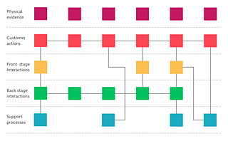
Service blueprints tie the customer's experience to the behind the scenes activities. They show the internal working of a service provider, the backend infrastructures, the internal policies, and the tools and systems that make it all possible.
A lifecycle map holds a more human-centered lens. It shows how processes are tied to the actions of the actors, how the action of one can impact on the progress of a task, and consequentially the options for other actors.
While service blueprinting exposes the business from surface-to-core, lifecycle mapping shows how a service functions from task-to-users, with the end users' goals at the centre of it all.
How is it different from a process map?
Process maps - also known as process flowcharts - describe the flow of work. A process map shows both the stages and the logics involved in a workflow.
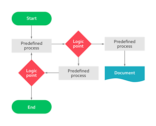
Lifecycle and process maps both visualise a series of events that produce an end result. While the latter focuses on the activities involved, the former highlights the impact these activities bring, both on the task and on other actors involved.
Comparing to the strict linear design of a process map, a lifecycle map shows both the linear progression of a task and the options each actor has at every stage.
On top of that, in most cases, people involved in the process of the task are much more visible in a lifecycle map, than in a process map.
Why is it a useful service design mapping technique?
1. It is very easy to make. Everyone can do it. It uses limited symbols and doesn't require a lot of space. Circles for actions, arrows for impact. With a marker and a whiteboard, you can create a lifecycle map easily. Post-it notes work very well too.
2. It brings all stakeholders together. I've always created lifecycle maps on paper or whiteboards first with stakeholders, such as business analysts, developers, technical architects and product owners. We talk about the task, the goals, the people involved and what they want or can do by interacting with the service. I draw the lifecycle map as we chat through various scenarios.
The drawing is then digitalised later and printed out for review in a common space. It grows as the conversation grows over time and helps people from all disciplines within the project to understand what the service is aiming for.
A lifecycle map is a common shared language, created and spoken by everyone.
**3. It keeps the focus on people and their goals. **When designing a service with a multi-disciplinary stakeholder team, the service designers often need to put a lot of effort in changing people's perspectives. Technical architects see the service through the lens of backend infrastructures. Business analysts talk in workflows. A lifecycle map is an artifact that contains nothing but the users' goal (the task), the people involved in the process of achieving that goal, and the actions people can take. It is just another thing that makes our users more visible in the eyes of our stakeholders.
4. It delivers more than just a design document. A lifecycle map can be a tool for all stakeholders. For example, it could be used to size and track work by the UX team and the Dev team. User Acceptance Test (UAT) managers can use it to enumerate test scenarios and acceptance criteria. The Project team can very quickly identify key features to be included in the Minimal Viable Product (MVP), and the future iterations.
How to make a lifecycle map?
The key components of a lifecycle map are stages, actors and actions.
The stages of a task.****They form the linear process of a task, which is the foundation of a lifecycle map. It is usually placed at the centre of the canvas.
The moment when the user sets a goal in a specific scenario, the task of achieving that goal becomes as a living-breathing thing. Depending on what people decide to do, it moves from one stage to the next. It's useful to focus on key stages that are not too broad or too narrow. In a scenario, where the user wants scrambled eggs in a restaurant, a nice list of stages could be 'browsing the menu', 'food ordered', 'food prepared' or 'food served'.
I'd like to use different colour blocks to illustrate these stages, with the descriptions clearly labeled on top.
**The actors. **Lines parallel to the stages line represent people involved in the task. What they decide to do will move the task along. Amongst these actors, some will be more active than others, in terms of pushing the task forward. In a lifecycle map, the lines representing them will be placed closer to the stages line.
**The actions. **There are three types of actions. In my example, the key actions that result in stage changes are drawn as solid circles. This could be 'the customer placing an order'. The consequential actions done by other actors are drawn as hollow circles. An example could be 'the waiter writing down the order', or 'the restaurant receives notification' if it's done digitally. The optional actions are drawn as textured spots. They show what the actors might do at different stages.
Now let's put them together.
Step 1. Decide whether you need a lifecycle map.****If there is a scenario which involves a task of multiple stages and multiple actors, drawing that as a lifecycle map could be useful to you. For example, the scenario of viewing and buying a house is a good lifecycle map candidate, whilst opening the door to a house is not.
**Step 2. **Start with the linear progression of a task. List all stages of the task. Line them up in the middle of your canvas. Expect the list to grow later, so leave plenty of spaces. This is the base of your lifecycle map. Create separate lines for each of the actors involved in the task. Remember, the actors, who have the most intimate relationship with the task should be placed closest to it.
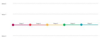
Step 3. Draw the key actions that will move the task from one stage to the next. Make sure to assign the action to the most suitable actor.
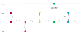
Well done. You have created a lifecycle map.
Now let's make it more realistic.
Step 4. Think about whether these key actions are self-initiated or triggered by some notification. Also, think about what impact a key action would bring to other people. For instance, a chef will not cook a dish unless they are informed that there's an order. If an action needs to be triggered and the action that triggers it is not on the map, then congratulations - you just found another hidden circle that needs to be surfaced.
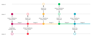
Step 5. Think about what else these actors can do at each of the stages. Draw these options on the actors' own lines. In the restaurant scenario, a customer can cancel their order after placing it and a waiter can suggest alternatives if needed.
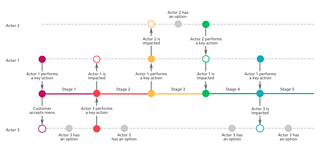
Step 6. Think about additional goals of the users or the service provider. You might realise that more stages and key actions need to be drawn. For example, if the restaurant's goal is to generate great reviews, they might invite the customers to participate in a survey afterwards. This introduces an additional stage to the original happy path.
Step 7. Think about what could go wrong. What if the customer is allergic to eggs? An additional allergy checking stage could be placed at the beginning to avoid any tragic experience. How about if the customer needs to leave early? We could have an option of offering orders yet-to-be-served as take-away.
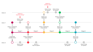
Here are some more tips.
Don't loop. For example, if the customer can ask for the menu again when the food is already served, simply put an action at the right stage and tag it 'this will bring us back to stage X'. This keeps the map simple to read, without lose the sight on users options and how we can support them.
Don't focus on tools at the beginning. Keep your stakeholders' attention on what people should do, need to do and want to do.
Keep it high levelled. 'The user cancels the order' is a better candidate than 'the user clicks the purple button'.
Work with your stakeholders on it. It's all about bringing everyone into the service design process, facilitating conversations that need to happen. Through doing it, you can help your stakeholders to see the service from the users' perspective.
**Expect the map to grow. **Keep exploring possibilities. The conversation with your stakeholders is as important as the map itself.
Conclusion
Lifecycle mapping is a service design tool. It brings all stakeholders together to design for all users involved in a task, no matter whether they interact with the front stage or the back stage of the service.
A lifecycle map keeps its focus strictly on the goals, the users and their actions. It is somewhere between a journey map and a service blueprint. It is a lightweight and flexible design document that grows as the design conversation grows.
When created together with stakeholders, a lifecycle map can be a commonly shared language and understanding of what a service can support the users to do.
The next time you need to design a service, why not give lifecycle mapping a go, and keep the conversation growing.
Originally published 17/04/18 on


