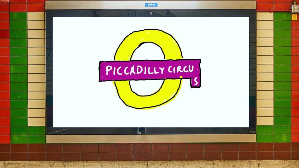
New logo for London Underground's Piccadilly Circus gets people talking!
- Published
- comments

The new sign is part of a campaign to see more art projects around London
Lots of us like to express ourselves by letting our creative juices flow, and one piece of bold artwork in London has been capturing the attention of lots of people - but not quite for all the right reasons!
The new piece of art has been made for the London Underground station Piccadilly Circus - one of the busiest stops in London.
The artwork, designed by 83-year-old English painter David Hockney, was unveiled by London Mayor Sadiq Khan. It shows an updated version of the famous London Underground logo which has been purposefully designed to look like it's been drawn using Microsoft Paint.
The brand new Piccadilly Circus station sign, features the name of the famous station with the letter 's' added below the rest of the letters. It is part of a bigger campaign which will see lots of major art projects taking place across the UK capital.
The new artwork has received a mixed response so far
The Mayor of London praised the artwork describing it as "brilliant", but not everyone has had the same reaction.
Lots of people took to social media to criticise the new design and some have even been inspired to recreate their very own signs for other London tube stations in the same style!
The design features a large yellow circle, which has been compared to an onion ring!
The new campaign will also see other artists transforming road crossings and street furniture in the capital.
What do you think about the new logo? Does it scream creativity or have you been left uninspired? Could YOU do better? Let us know in the comments!
- Published4 April 2015
- Published11 June 2020
