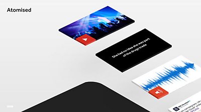
in collaboration with . We originally set out to run for three months to evaluate its performance with audiences and journalists. As a first positive sign of its performance, the pilot was actually extended to a total of five months as Newsbeat journalists enjoyed writing certain, complex stories in this new format. As the Newsbeat Editor, Anna Doble, later told us “this format made us more disciplined about story structure and simplicity.”
The Newsbeat Explains pilot ran on from August to the end of December 2016. It has been conceived as a mobile-first prototype aimed at younger audiences who are typically harder to reach by broadcasters. This concept aims to explain complex topics to our audience in a way that feels quite light and snappy. Journalists used it for niche original journalism and big broad topics.
The purpose of the public trial was to test our concept at a larger scale, with real audiences and over an extended period of time. The trial aimed to measure audience interest and gather feedback to understand if people engage with this new format for news stories.
As this format was welcomed by our target audience and journalists who used the prototype, it was selected as a new format for providing important Q&As prior to the 2017 General Elections. We have been working with journalists and using live production systems since the election was called a month ago to ensure a relatively smooth .
While our findings from our work on Newsbeat Explains is not intended to provide the solution to the future of news, we hope they will give some useful insights on how the prototype performed throughout the trial and how it was perceived by our audiences.
Newsbeat Explains was built using existing ����ý News production systems - CPS, & - in new, interesting ways. We didn’t want to impose new workflows upon Newsbeat journalists creating the content as we were interested in testing the concept rather than custom-made tools. Furthermore, we wanted to test the end-to-end workflow and learn how to use this process for creating stories at fast, newsroom pace. It was built as a fully responsive UI across desktop, tablet and mobile devices.
We were interested in gathering insights on our concept from two target groups: end users and journalists. More specifically we wanted to know:
End users
- Do people engage with this format?
- Does it help understand the story better?
- Does it fit with their current consumption patterns?
Journalists
- Test the end-to-end workflow
- Understand if the writing style works
- Learn how to create atomised content at fast, newsroom pace
A combination of quantitative and qualitative data has been gathered for the trial’s duration to evaluate it against our research questions. We adopted a 360 approach to evaluation of the pilot employing diverse tools for data gathering - from pure quantitative data tools to questionnaires, individual interviews with end users and journalists.
in our defined format over the duration of the trial and successfully attracted a substantial audience reaching approx 120k visitors. Reaching our audiences on a larger scale allowed us to identify patterns and answer with a degree of confidence, or at least provide us with clearer insights on some of our research questions.
The data gathered during the trial tells us visitors spent an average of 56 seconds. This reaffirms feedback from our target audience on time spent reading news in previous controlled user testing iterations on a smaller scale.
We also know about 40% of visitors opened approx 3.7 atoms - each story having on average 6 atoms. While we cannot ascertain which atoms were opened or their order, this could indicate a ‘skimming and digging’ pattern with visitors choosing which aspects of the story to find out more or preferring the overview mode as it appears to be the case for 60% of visits.
Together with the average time spent, this might indicate visitors consumed the information that mattered the most to them without having to read it all as the average time taken to read an non-atomised Newsbeat page is 1 minute 20 seconds. This was reaffirmed by feedback from the controlled user study.
- “if the subheading enticed you, you could read more, but if it wasn't your thing, you could just leave it. It wasn't daunting, like a big wall of text” [Participant 06]
As it was not integrated into the main ����ý News website, it required a diversified promotional strategy to reach our audiences. Newsbeat journalists advertised each new story published on the pilot via Twitter, Facebook and a link within the relevant story on the main Newsbeat site. It was also promoted via Taster and ����ý Homepage.
- is a new way of telling stories, piece by piece. This one on — ����ý Newsbeat (@����ýNewsbeat)
The responses from Taster and the user study indicate the format was engaging and the information provided for each of the stories sufficient. Its simplicity and ‘straight to the point’ approach resonated well with an audience consuming news mainly from social networks.
The user study was designed to evaluate Newsbeat Explains in greater depth. It took the form of a 6-day ‘diary study’, followed by phone interviews with an even gender split of twelve, 19 to 24 year olds based in London and Manchester.
From the user study Newsbeat Explains emerged as a clear winner compared to a conventional article format in terms of presentation, length of content and writing style.
Participants who prefered the Newsbeat Explains format liked:
- the use of sub-headings (atoms in the spine) that clearly described additional information
- the flexibility of the format - allowing them to read what they wanted
- the summarised text - that made the article feel brief and to the point
- “I like the way it was summarised and then I knew that that was what I was getting more information about” P02 [Sub-heading with additional information]
- “... you could avoid certain paragraphs if you wanted to.” P11
- “you can physically click on it yourself and it's more shortened the text, you get more to the point” P12 [Summarised text]
When comparing the prototype Newsbeat Explains articles with the control Newsbeat articles, participants who preferred the prototype format overall felt that the format distinguished itself on:
- Control - read at my own pace, open sections when ready
- Writing style - straight to the point, ‘like childrens’ news
- "It was very informative for such little text, which I did like..” P09
- “really well explained. put quite simple.” P12
- “Just easy to read. It was really easy to read. I got all the information I needed and there wasn't like waffle.... when you read a news article there's a lot of waffle in it that just sort of repeats the same thing, or it'll add unnecessary wording..” P03
- "I think it keeps you more engaged. Like, with the full text one you might lose interest quickly" P07
The Definitions, however, didn’t test as well as expected with only a tiny proportion of the visitors (6%) opening on average only 1 definition. Our user study gave us some better insights on the reason why it didn’t perform as well. There is a mix of UI issues with the affordance not being clear or buttons not sufficiently prominent in the layout. However, what emerged as the main issue is the terms used to ‘define’ as participants to our study found they knew the terms already and felt the use of Definition was patronising.
As already mentioned, it was as important to us to evaluate this concept with the editorial team as much as with our audiences.
From a production workflow aspect, it is evident the way journalists had to use the Vivo publishing platform to create stories in our format was far from ideal. We always knew this was not going to be an easy task as we had to make several workarounds in the current workflow to generate stories for our pilot. While we know this is a real issue for a fast-paced newsroom environment, we are also confident those are issues that would be resolved if a production system would support the Newsbeat Explains writing structure.
It has been great to work alongside the journalists to gather insights of the challenges and advantages of using our format. It is encouraging journalists think this format works well for explainers or more niche stories - not breaking news - and they feel it makes them more disciplined about how to structure the story.
Reaching our audiences on a larger scale allowed us to identify patterns and answer with a degree of confidence, or at least provided us with clearer insights on some of our research questions.
In summaryOur pilot shows the Newsbeat Explains format is sufficiently comparable to conventional Newsbeat articles. It attracted a significant audience for a prototype with limited, non-breaking news stories. The promotion on bbc.co.uk broadened the range of demographic and the stories were mostly covering serious topics. Nevertheless, out of all those visitors who rated and took part in the Taster online questionnaire, a good percentage was made up of the target audience we wanted to target with very positive responses. A further indication of engagement could be identified in the fact our pilot stories were shared at a similar rate as conventional Newsbeat articles.
Feedback from the controlled user study gave us a clearer indication that they liked this format. It seems to fit well with our audiences consumption patterns as a mobile-first proposition. The overview format - or flow chart as some referred to - acted as a guide of what was covered in the story. This actually can be an advantage as it will encourage readers to expand the sections and read further information.
Some minor tweaks to the interaction with atoms would be needed. However, it is the Definition feature that requires more thinking to ensure it provides a clear added value for our audience.
Overall, the findings gathered throughout the duration of the trial are largely positive and indicate Newsbeat Explains is a desirable format for writing complex or niche stories and works well as a mobile-first proposition.
This phase of our research gave us sufficient information to continue our work on articles using the concept of atomised content. We will build on our what we learned so far and continue identifying ways news stories can be created and delivered to our wider audiences enabling new, adaptive experiences.
- -
-

Internet Research and Future Services section
The Internet Research and Future Services section is an interdisciplinary team of researchers, technologists, designers, and data scientists who carry out original research to solve problems for the ����ý. ����ý focuses on the intersection of audience needs and public service values, with digital media and machine learning. We develop research insights, prototypes and systems using experimental approaches and emerging technologies.
