Charting the UK's changing weather
- Published

The anomaly maps that are used to highlight when weather deviates from what we would normally expect have been revised recently - but what are they and what does this mean for the way we understand what is going on?
What are anomaly maps?
The first map shows June 2020 mean max temperature, while the second compares June 2020 with the mean max temperature for June across the previous 30 years
You might have spotted maps like this in our UK broadcasts, particularly towards the end of a month or season. They show the average conditions in the UK for that month, highlighting information like whether it has been wet or dry, warm or cold compared with the long period average.
What are long period averages?
The World Meteorological Organization (WMO) measures climate in 30 year periods and so do these anomaly maps. When a weather broadcast says "temperatures have been five degrees above normal today", the word "normal" refers to the temperature at the same location and time of year which have been recorded and averaged out over the last three decades. This gives a benchmark with which to compare current conditions.
We also have access to seasonal and annual climate data for rainfall, temperature (minimum, maximum and mean) and sunshine.
Why are these statistics changing?
Weather is always evolving and these statistics are usually changed every 10 years. For the last decade we have been using climate averages from 1981 to 2010. However, many of our hottest years have been recorded very recently and so were not represented in the averages referred to in our broadcasts. Now, the years 1991-2020 have become the new reference period we use when we compare current conditions with the long term average.
The World Meteorological Organization has recommended that all countries update the time period of the maps they use for their climate data.
How do I interpret these graphics?
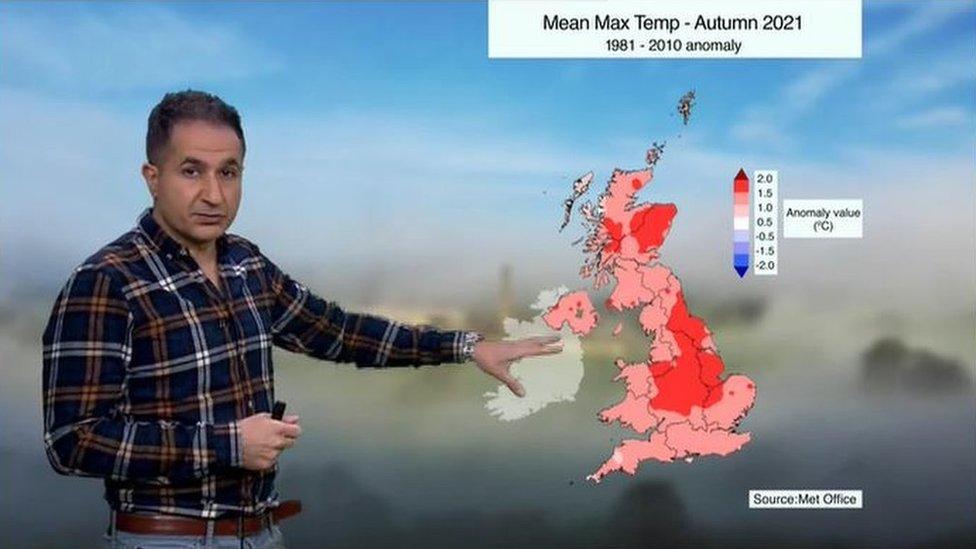
Ben Rich uses an anomaly map to show the mild weather in the closing weeks of 2021
You can read an average temperature map, like the one above, using the key shown on it, which displays colours from blue to red. Areas above their average are shown in red. The deeper the red, the further above average. The deeper the blue, the further below average.
For rainfall, the graphics tend to use brown and blue, with brown showing less rainfall than average, and gradually increasing rainfall above average turning the map blue.
How are these charts used in 湮砓換羸 Weather broadcasts?
Historically, these charts were most often used to show how rainfall or temperatures departed from the long term average. Nowadays, the 湮砓換羸's graphic designers and advances in computer modelling mean we can collate this information into forecast charts for days ahead.
When we have exceptional weather anywhere in the world they can be used to show how it compares with the average conditions for that particular place and time.
An anomaly map is used to explain the Canadian heatwave in summer 2021 by 湮砓換羸 Forecaster Ben Rich
You can see an example of this above. The hot weather in Canada in June 2021 saw temperature records shattered as they soared close to 50C. This anomaly temperature map with its deep red colours over North America clearly shows how exceptional this heat was.
These maps are a very powerful tool for weather forecasters and broadcasters. The more up-to-date they are, the more accurately we can explain what is happening, keeping everyone as well informed as we possibly can.