Learning about setting in a story
Follow these simple steps about how to make a poster eye-catching!
In this article you can find out:
- How to make an eye-catching poster
- What information to include on a poster
- How to use different fonts
This resource is suitable for informative writing for P2, P3, P4, P5, P6 and P7 (First and Second Level Curriculum for Excellence).
Video - Story structure
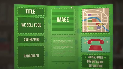
Watch this video to learn how to make a poster.
Follow these simple rules on how to make a poster eye-catching.
What is a poster?
You will find posters everywhere. They are on the side of buildings, in shop windows, on the side of roads, on bus stops and even on buses.
Posters are mainly used to:
- provide information
- sell products
- advertiseTo draw attention to something, like a product or an event, so more people know about it. events
How to make a poster

Image caption, Eye-catching heading
Choose a short, simple and catchy headline for your poster. There is lots of competition for people’s attention, so your poster needs to explain what it is about quickly and simply.
Image caption, Important information
You need to include any important information explaining where and when an event is happening, or why people might want to use a product.
Image caption, Text
We need to be able to read the text from a distance. Use bigger text, different fonts and add some colour.
Image caption, Images
Lots of small images will make your poster seem cluttered. One big striking image is much better.
1 of 4
An eye-catching headline
- There is lots of competition for people’s attentionTo notice someone or something interesting or important., so your poster needs to be eye catching.
- If you are promoteTo encourage people to notice or do something. a gig for a new band what would we say?
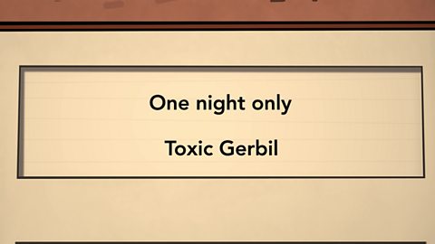
One Night Only! Toxic Gerbil.
That’s short, simple and catchy.
Important information
You need to include important information explaining where and when the gig will take place.
Friday 13th March
Music Hall
Doors open 7pm
Text
We need to be able to read the text from a distance. If we use bigger text and add some colour then it will stand out more and people will notice it!
One night only
Toxic Gerbil
- fontThe style and size of typed text. are important and there are so many to choose from.
- You should take your time to select the right style so that it suits the design of your poster.
- The look and style need to appeal to the audience you have in mind.
Images
- Next, we want to add some pictures to make the poster more attention-grabbing.
- Lots of small images will make your poster seem clutteredWhen a space is covered or filled with lots of things. . One big striking image is much better.
Summary
You can use different fonts, images and style when you are designing your poster to appeal to different audiences.
Key words about structuring a story

- Sorry, something went wrongCheck your connection, refresh the page and try again. – To draw attention to something, like a product or an event, so more people know about it. For example, 'They haven’t been selling many new trainers this month, so the company had to advertise more.'
- Sorry, something went wrongCheck your connection, refresh the page and try again. – To notice someone or something interesting or important. For example, 'I was cold and wet at the football match and I couldn’t pay much attention to the game.'
- Sorry, something went wrongCheck your connection, refresh the page and try again. – To encourage people to notice or do something. For example, 'He had worked hard promoting healthy eating and now lots of people were enjoying their fruit at lunchtime.'
- Sorry, something went wrongCheck your connection, refresh the page and try again. – The style and size of typed text. For example, 'The book with larger font was much easier for the class to see.'
- Sorry, something went wrongCheck your connection, refresh the page and try again. – When a space is covered or filled with lots of things. For example, 'It was so difficult to see them because there were piles of books and papers cluttered all over their table.'
- Sorry, something went wrongCheck your connection, refresh the page and try again. – Being good at persuading someone to do something. For example, 'It was too cold and he didn’t want to go swimming, but his friend was very persuasive with the offer of a hot meal afterwards.'
Test your knowledge
Quiz
Challenge

Create a poster to persuade everyone to try your favourite food.
It could be a bunch of bananas, ice-cream or chicken and chips.
ёй±ріѕ±ріѕІъ±р°щ…
- Think of an eye-catching headline for your favourite food
- Add details and important information. What are the best things about the food you have chosen?
- Use a mix of different fonts, sizes and colours for your text.
- Draw a big attention-grabbing picture of your food.
More on Factual writing
Find out more by working through a topic
- count2 of 8

- count4 of 8

- count5 of 8
