Prior to the widespread use of computer graphics, the on screen identities ('idents') of ����ý TV channels were generated mechanically. Mechanical clocks were also seen regularly, often before important broadcasts such as the national news.
Two idents are on show at the Media Café in New Broadcasting House, London, and the last mechanical clock to be used on air is also on display, and several other examples are on display at ����ý sites and the National Media Museum in Bradford.
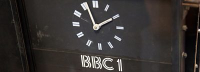
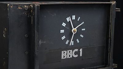
����ý One clock
The screen clocks were shown at major junctions between programmes and always before the news. The first ����ý ident was introduced in 1953 in response to the impending launch of commercial television. The screen clock was used before the news of ����ý One in 1981.
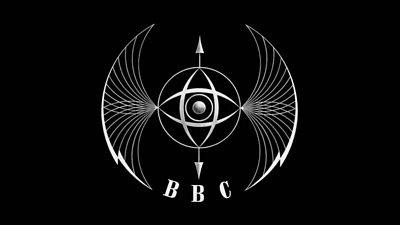
Abram Games' Television Symbol
Abram Games was commissioned to design an on-air image for the ����ý Television Service, probably hastened by the imminent arrival of commercial competition. Games, who designed the logo for the Festival of Britain in 1951, created the logo nicknamed the 'Bat's wings' logo, an elegant and rather ethereal image which captured the spirit of the times. In reality, it was an elaborate mechanical brass contraption, with a tiny spinning globe in its centre - for ����ý Scotland, the spot in the middle was replaced by a lion.

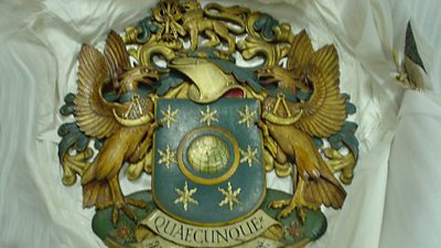
Alternative ����ý crest
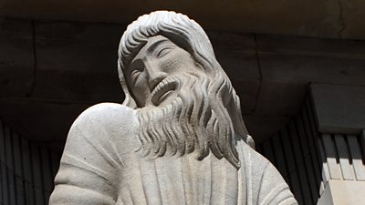
This wooden ����ý crest (1934), carved by George Kruger Gray, is found in the Council Chamber of Broadcasting House, London. It is very unusual in being the only ����ý crest to carry the alternative motto - 'Quaecunque' (whatsoever), and not the usual ����ý motto, 'Nation Shall Speak Peace Unto Nation'.
The quotation is taken from St Paul's Epistle to the Philippians: 'Whatsoever things are true, whatsoever things are honest, whatsoever things are just, whatsoever things are pure, whatsoever things are of good report: if there be any virtue and if there be any praise, think on these things.' The original motto is the one used on the Coat of Arms, and most commonly associated with the ����ý today.
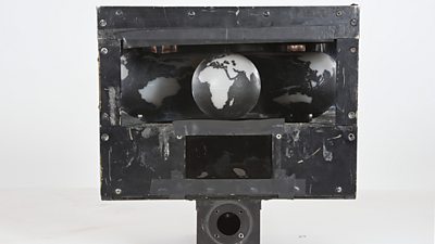
����ý revolving globe
Mechanical idents or screen clocks were shown at major junctions between programmes and always before the news. The first ����ý ident was introduced in 1953 in response to the impending launch of commercial television. The revolving black and white globe began life in 1963.
Colouring techniques were used to show it in blue and yellow after the advent of colour in 1967. The globe remained a symbol for ����ý One until 2002 – its last incarnation was as a hot-air balloon.
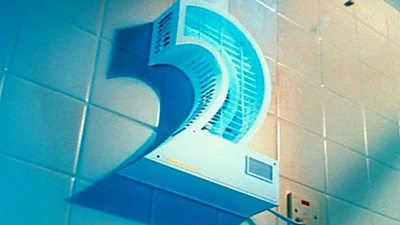
����ý Two - the logo
In February 1991 the brand specialists Lambie Nairn produced its first set of ����ý Two logos, part of a new look for the channel. Initially all the logos appeared in the colour viridian. However, the idents matured over the years, becoming individual characters on a yellow background, and latterly as a cut out 'window on the world'.
All have been hugely popular with the public. Celia Chapman, Executive Producer, Lambie Nairn said: "����ý Two was probably the first ident that got its own fanmail!". After the original idents were reused for the 50th anniversary of the channel in 2015, the original set returned by popular demand. The plucky 2 was replaced by an all-new 'Curve' look in 2018.

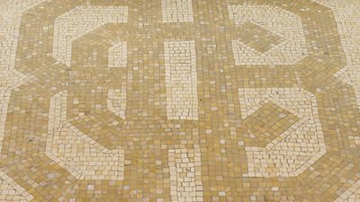
����ý mosaic logo
This is one of the earliest versions of a ����ý logo. It is found at the centre of the original mosaic floor in the reception of Broadcasting House, London. Completed in 1932, Broadcasting House is a jewel of Art Deco design, which integrated a wide range of artists and designers in the conception and embellishment of the UK's first ever purpose-built radio centre.
No-one knows who actually designed this mosaic logo, but its interlaced tracery of letters appears at various points in and around the building, notably on the reception doors and inside the lifts.
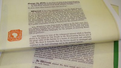
The first ����ý Charter
The ����ý has all eight Royal Charters. It started life as a Company, but changed to a Corporation following a report by the Crawford Committee. The Government accepted the Committee's findings and established by Royal Charter the British Broadcasting Corporation. The Charter set out the way in which the ����ý would be governed.
The first Charter ran for 10 years from 1 January 1927 and recognised the ����ý as an instrument of education and entertainment. Subsequent Charters expanded this remit to include the dissemination of information. The eighth Charter of 2017 is on display in the lobby of ����ý Broadcasting House.
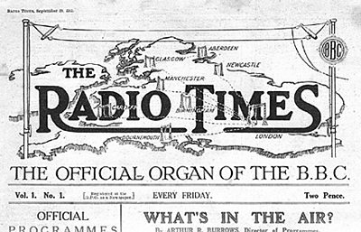
The first Radio Times
Here is the first edition of The Radio Times, 'the official organ of the ����ý', which appeared on news stands on 28 September 1923. It came into existence initially because of the huge resistance from newspapers to the new medium of radio. Faced with the possibility of a press embargo of radio listings, Director-General John Reith decided that the ����ý would publish its own listings magazine.
At first, it was a joint venture between the ����ý and publisher George Newnes Ltd. But in 1925 the ����ý took over editorial control, and by 1937 the entire operation was in-house. The Radio Times used leading writers and illustrators of the day and the covers from the special editions are now regarded as design classics.
Further reading
-
The Story of ����ý Television Idents
The ����ý's on-air look from 1936 to the present day.