Distribution of data
You will be building upon material covered in M1 Mean, median, mode and range, M1 Frequency tables and M2 Estimate the mean.
Quartiles
Quartiles are the values that divide a data set into quarters:
- Put the values in order
- Divide the list into four equal parts
- The Quartiles are at the divisions
The interquartile range shows the range in values of the central 50% of the data.
To find the interquartile range, subtract the value of the lower quartile Q1 from the value of the upper quartile Q3.
interquartile range = upper quartile - lower quartile
Example
The weights of 7 babies are:
3.5 kg, 4.1 kg, 3.4 kg, 2.5 kg, 3.5 kg, 4 kg, 3.1 kg
Find the interquartile range of the weights of the babies.
Solution:
The weights are already in order
\(2.5\qquad 3.1\qquad 3.4\qquad 3.5\qquad 3.5\qquad 4\qquad 4.1\)
To find the interquartile range
- Start by putting the values in order
\(2.5\qquad 3.1\qquad 3.4\qquad 3.5\qquad 3.5\qquad 4\qquad 4.1\) - find the median
The median is the 4th value which is 3.5
\(2.5 \qquad 3.1 \qquad 3.4 \qquad\fbox{\textbf{3.5}} \qquad 3.5 \qquad 4 \qquad 4.1\)
To find lower quartile which is Q1
- count the number of values below the median
- identify the middle of those values
\(\fbox{2.5 \qquad \textbf{3.1} \qquad 3.4} \qquad 3.5 \qquad 3.5 \qquad 4 \qquad 4.1\)
To find the upper quartile which is Q3
- count the number of values above the median
- identify the middle of those values
\(2.5 \qquad 3.1 \qquad 3.4 \qquad 3.5 \qquad \fbox{3.5 \qquad\textbf{4} \qquad 4.1}\)
interquartile range = upper quartile - lower quartile
= 4 - 3.1
Interquartile Range = 0.9 kg
Question
An 8th baby was born weighing 2.9 kg. Find the interquartile range of the 8 babies.
Answer:
\(\matrix{2.5 & & 2.9 & & 3.1 & & 3.4 & & 3.5 & & 3.5 & & 4 & & 4.1 & & \cr && &\boldsymbol{\uparrow}& && &\boldsymbol{\uparrow}& && &\boldsymbol{\uparrow}& && && \cr && &\textbf{Q1}& && &\textbf{Q2}& && &\textbf{Q3}& && &&}\)
Q1 = 3.0
Q3 = 3.75
Inter quartile range (IQR) = Q3 ÔÇô Q1 = 3.75 ÔÇô 3.0 = 0.75 kg
Question
A school librarian records the number of books borrowed in a school year by some Year 9 pupils. She arranges the data from smallest to largest.
5ÔÇé6ÔÇé10ÔÇé12ÔÇé12ÔÇé14ÔÇé14ÔÇé16ÔÇé18ÔÇé18ÔÇé19ÔÇé19ÔÇé20ÔÇé22ÔÇé23ÔÇé25ÔÇé27ÔÇé27ÔÇé28
Identify the median value and the upper and lower quartiles.
Answer:
There are 19 values
\(5\ 6\ 10\ 12\ \fbox{12}\ 14\ 14\ 16\ 18\ \fbox{18}\ 19\ 19\ 20\ 22\ \fbox{23}\ 25\ 27\ 27\ 28\)
- median = 18 (the 10th value)
- lower quartile = 12 (the 5th value)
- upper quartile = 23 (the 15th value)
Box plots
A box plot is a diagram which provides a quick visual summary of the distribution of a data set. It makes drawing conclusions easier and is useful for comparing two sets of data.
When data is presented as a list of numbers, it can be difficult to interpret.
Box plots summarises the data set using 5 key values.
- minimum
- maximum
- median
- lower quartile
- upper quartile
These can be found easily once the values are arranged in order.
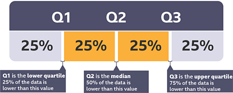
The minimum value is the smallest number in the data setThe maximum value is the largest number in the data setThe median is the middle value.
50% of the data is larger than this value and 50% of the data is smaller.The lower quartile is the middle value of those lower than the median.
75% of the data is higher than this value and 25% is lower than this value.The upper quartile is the middle value of those higher than the median.
25% of the data is higher than this value and 75% is lower than this value.
Question
Blayne is captain of the school cross country team. He recorded the times taken by 17 members of the team in the last race.
19ÔÇé42ÔÇé24ÔÇé35ÔÇé26ÔÇé27ÔÇé30ÔÇé40ÔÇé33ÔÇé34ÔÇé15ÔÇé36ÔÇé36ÔÇé20ÔÇé33ÔÇé42ÔÇé28
Blayne wants to display these results in a box plot.
Solution:
Firstly, he must order the data:
15ÔÇé19ÔÇé20ÔÇé24ÔÇé26ÔÇé27ÔÇé28ÔÇé30ÔÇé33ÔÇé33ÔÇé34ÔÇé35ÔÇé36ÔÇé36ÔÇé40ÔÇé42ÔÇé42
Next find the 5 key values
Follow the steps to draw the box plot.
- minimum
- maximum
- median
- lower quartile
- upper quartile
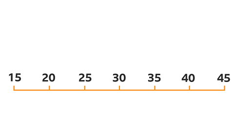
Image caption, Step1: Draw a scale. This is just like the horizontal scale on a graph
![Scale of 15 - 45 in marked every 5 - [15] minimum, [25] lower quartile, median, upper quartile and maximum labelled](https://ichef.bbci.co.uk/images/ic/480x270/p0hks0rf.png)
![Scale of 15 - 45 in marked every 5 - [15] Box drawn around middle three values](https://ichef.bbci.co.uk/images/ic/480x270/p0hks0zq.png)
![Scale of 15 - 45 in marked every 5 - [15]. Box around middle 3 values lines to minimum & maximum values](https://ichef.bbci.co.uk/images/ic/480x270/p0hks1b5.png)
1 of 4
Interpreting box plots
The 5 key values, minimum, maximum, median, lower quartile and upper quartile can be easily read from box plots.
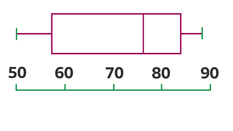
- Estimate the median mass of the football players?
- What is the mass of the lightest player?
- 75% of the players are over 70 kg. True or false.
- Estimate the interquartile range.
Answer:
- The median is indicated by the line inside the box. It is approximately 76 kg.
- The lightest player is 50 kg.
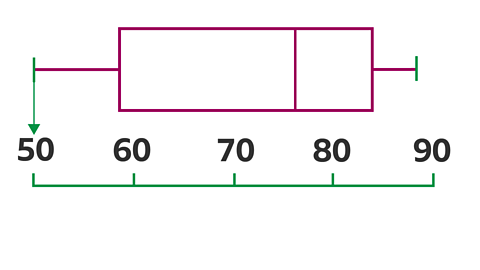
- FALSE - 75% of the players are over the lower quartile which is approximately 57 kg.
- The upper quartile is 84 and the lower quartile is 57.
Interquartile range = upper quartile - lower quartile
IQR = 84 ÔÇô 57 = 27
Question
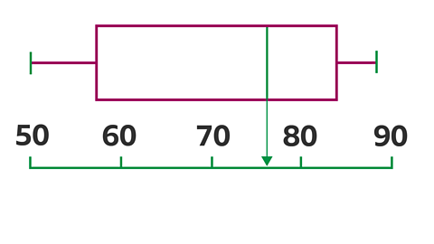
The box plot shows the marks in a science test for a group of students.
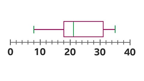
- What is the range of the data?
- What is the lower quartile?
- Calculate the interquartile range of the data.
- The top 25% of the pupils get an A. What mark was required for an A?
Answer:
- 35 ÔÇô 8 = 27
- 18
- 31 ÔÇô 18 = 13
- 31
Comparing data sets using box plots
Box plots can be used to compare two or more sets of data.
Example
The box plots show goals scored by two netball teams.
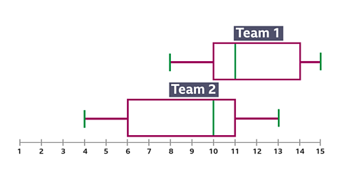
Compare the teams using the box plots.
Answer:
Team 1 had a higher median and their interquartile range was smaller. This would suggest that they are likely to score more goals than team 2 and are more consistent.
Cumulative frequency
Cumulative frequency is a running total of the frequencies. The running total is calculated and recorded in an extra column on a frequency table. It can also be represented on a graph by plotting the upper boundary of the groups.
Example
The table below shows the lengths of 40 babies at birth.
To calculate the cumulative frequencies, add the frequencies together.
| Length (cm) | Frequency | Cumulative frequency |
|---|---|---|
| 30 < l Ôëñ 35 | 4 | 4 |
| 35 < l Ôëñ 40 | 10 | 14 (4+10=14) |
| 30 < l Ôëñ 45 | 11 | 25 (14+11=25) |
| 45 < l Ôëñ 50 | 12 | 37 (25+12=37) |
| 50 < l Ôëñ 55 | 3 | 40 (37+3=40) |
A cumulative frequency diagram is drawn by plotting the upper class boundary with the cumulative frequency. The upper class boundaries for this table are 35, 40, 45, 50 and 55.
Cumulative frequency is plotted on the vertical axis and length is plotted on the horizontal axis.
Finding averages from a cumulative frequency
A cumulative frequency diagram is a good way to represent data to find the median, which is the middle value.
To find the median value, draw a line across from the middle value of the table. In the example above, there are 40 babies in the table. The middle of these 40 values is the 20th value, so go across from this value and find the median length.
Finding the interquartile range
A cumulative frequency diagram is also a good way to find the interquartile range, which is the difference between the upper quartile and lower quartile.
The interquartile range is a measure of how spread out the data is. It is more reliable than the range because it does not include extreme values. A high value for the interquartile range shows that the data is spread out. A low value for the interquartile range means the data is closer together or more consistent.
Example
There are 40 babies in the table, so to find the lower quartile, find ┬╝ of 40, which is the 10th value. Reading from the graph, the lower quartile is 38.
To find the upper quartile, find  of 40, which is the 30th value. Reading from the graph, the upper quartile is 47.
The interquartile range is the upper quartile ÔÇô the lower quartile, so for this data the interquartile range is 47 - 38 =9.
Drawing a box plot from a cumulative frequency
Drawing a box plot from a cumulative frequency graph is straightforward as long as the median and quartiles have been found.
The guideline for median, lower quartile and upper quartile can be used to plot the sections of the box plot. The minimum and maximum values of the box plot are where the cumulative frequency begins and ends.