Please read the Licensing terms before you download this content.
Overview
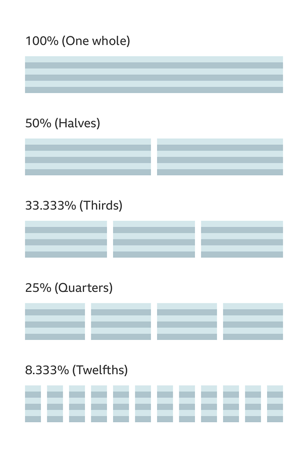
We use a flexible grid that has percentage-based columns, fixed margins and gutters. The columns are used to adjust the layout, making the best use of the space available.
Spacing and layout
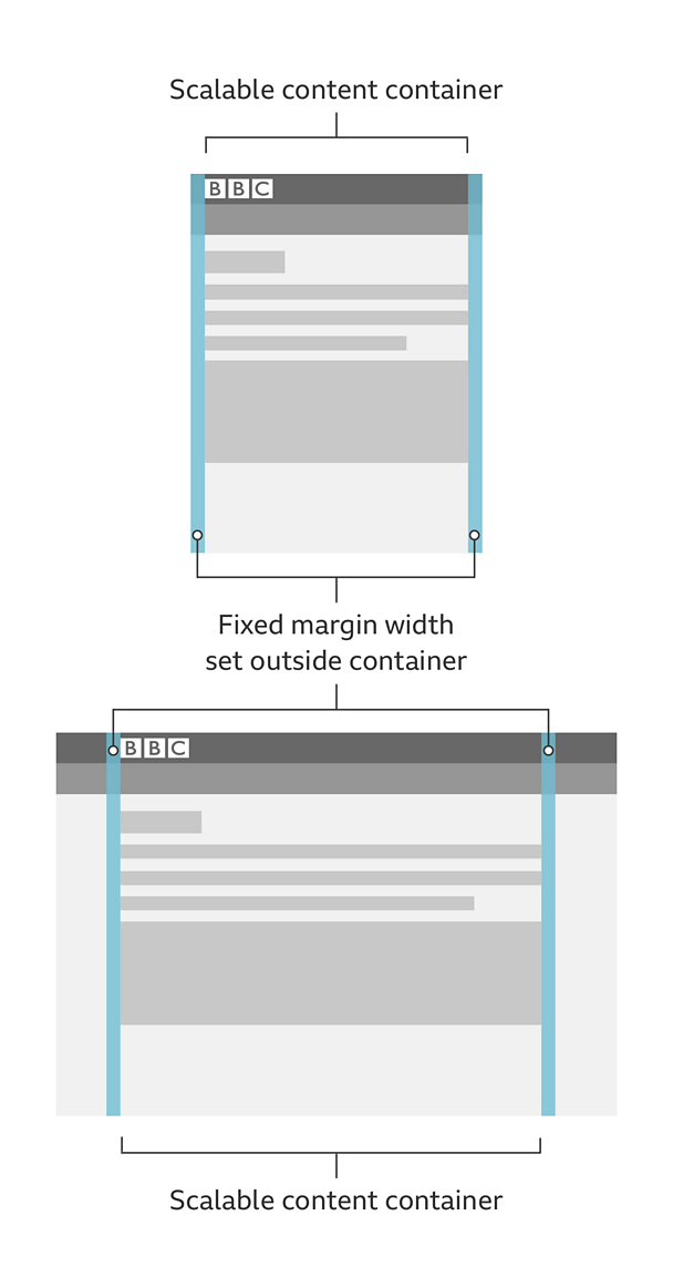
The grid uses fixed margins and gutters to help control the proportion and balance of the page. The margins and gutters are set to 8px for small screens and 16px for larger screens.
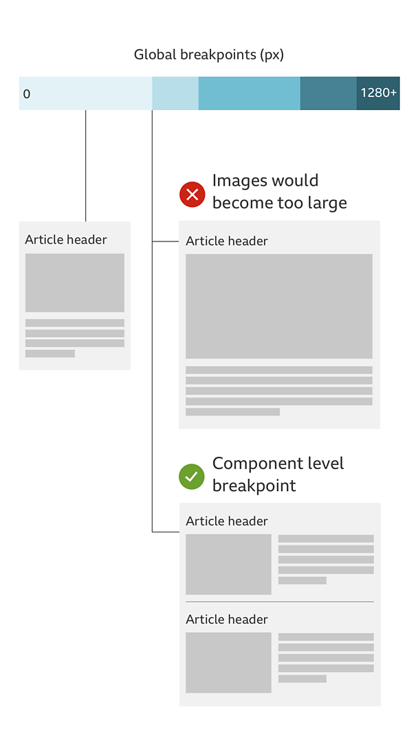
We change the sizes at different breakpoints to give the best possible layout for viewing our content.
For large screens we set the grid to a maximum width of 1280px, giving a content area of 1248px.
Creating layouts
Any number of columns can be used to suit the content and create interesting layouts at different widths.
In the browser the columns will be built with percentages and will be 100% width by default. If required the percentage can be changed and columns can be introduced.
This provides a large amount of flexibility to suit the content on any device.
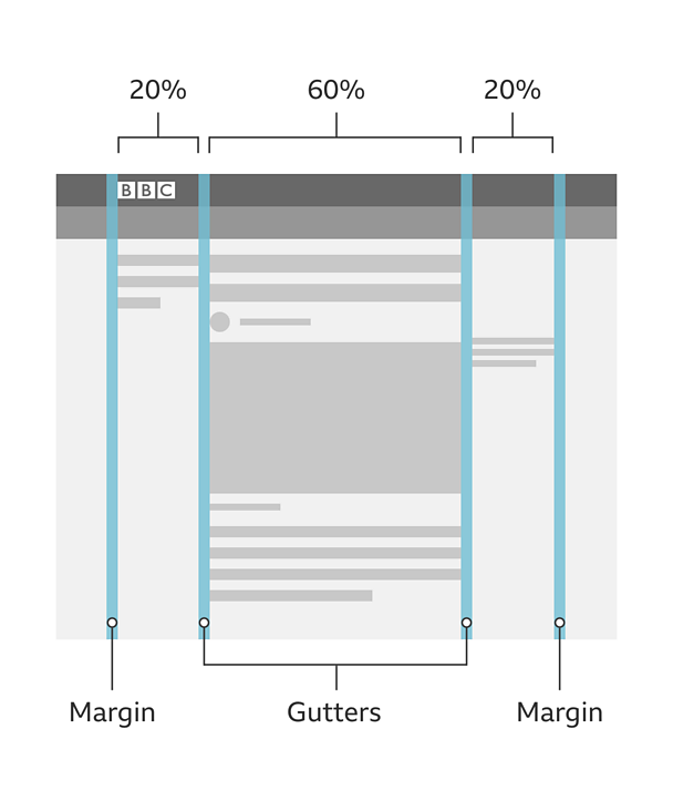
An example of this would be with an article page. On a large device, the main reading column could be sized at 60% and the supporting content can be placed in outer columns that are both sized at 20%. Providing a centralised reading experience with a suitable line-length.
Baseline
Spacing between components and elements should always be at least 8px - this is our baseline.
This baseline helps with the vertical alignment and spacing of content.
Grid sizes
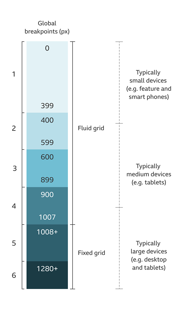
Our grid groups use the following breakpoints, where there are big changes to the grid. This covers all screen widths across many devices.
- Group 1: 0 - 399px
- Group 2: 400px - 599px
- Group 3: 600px - 899px
- Group 4: 900px - 1007px
- Group 5: 1008px+
- Group 6: 1280px+
From 1008px - 1279px the grid should remain a fixed at 1008px and then snap to 1280px.
Depending on the device width, we apply specific margin and gutter sizes. Below are the required sizes for each grid group in pixels.
| Grid Group | Width | Margins | Gutters |
|---|---|---|---|
| Group 1 | 0 - 399px | 8px | 8px |
| Group 2 | 400px - 599px | 16px | 8px |
| Group 3 | 600px - 899px | 16px | 16px |
| Group 4 | 900px - 1007px | 16px | 16px |
| Group 5 | Fixed 1008px+ | 16px | 16px |
| Group 6 | Fixed 1280px+ | 16px | 16px |
Considerations
The flexibility of the grid means you can create many different layouts and page types.
Design for the smallest sizes and lowest capabilities first. Then optimise for different screen sizes. Don't make assumptions about the devices that are being used.
Start with a single column layout and then bring in more columns as the content needs it. Column sizes are percentage-based and should work to ratios such as halves, thirds, quarters and so on.
Licensing
These assets are available for download on the following licence terms:
You can:
- Download the assets and use them free of charge;
- Use the assets without attribution; and
- Modify or alter the assets and edit them as you like.
You can't:
- Use the assets in a way that would bring the 大象传媒 into disrepute;
- Make available the assets so that they can be downloaded by others;
- Sell the assets to other people or package the assets with others that are for sale;
- Take payment from others to access the assets (including putting them behind a paywall);
- Use the assets as part of a service that you are charging money for; or
- Imply association with or endorsement from the 大象传媒 by using the assets.
Disclaimer: The assets are offered as is and the 大象传媒 is not responsible for anything that happens if you use them.


