Overview

How it works
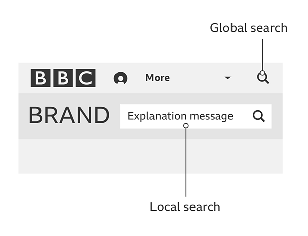
Local search is made up of an input field, search text and the 'search' icon (a magnifying glass). How the pattern is styled and positioned is up to the product team.
A product focused placeholder message will be visible before you select the search box, for example the ´óĎó´«Ă˝ Weather local search says 'enter a town, city or postcode'.

Once someone selects the search box, there will be a clear state change (e.g a blue outline or change in colour). The search message will stay the same.

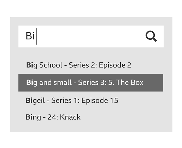
The message clears when typing starts. The auto-suggest results will then appear.

Rules
- Local search should always have clear task-based placeholder text such as 'enter a motorway, town or postcode'.
- The minimum tap areas around auto-complete results are 32 pixels for grid groups 4 (desktop) and 44 pixels for grid groups 1, 2 and 3 (mobile and tablet). For more information on tap areas, read our guide on how to design for touch.
- Results should be presented in a dropdown below the search box. This dropdown can extend to the same length as the box.
Variations
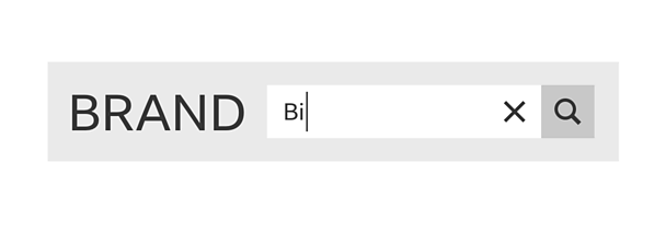
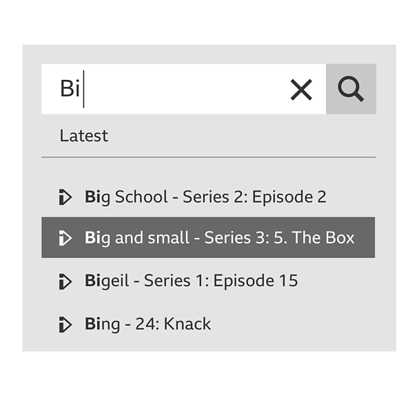
We recommend putting the 'search' icon in a clear container to show that it's the main call to action. We also recommend introducing a 'cross' icon into the search bar, making it easier to remove the text, cancel the action or start again.

Within the auto-complete, the results can include titles, iconography and category tags to provide more information about the selection.

Pattern in action
This pattern is currently being used by ´óĎó´«Ă˝ Radio, ´óĎó´«Ă˝ Food and ´óĎó´«Ă˝ Weather.

