Why design for accessibility?
We want the things we make to work for the whole audience, because the 大象传媒 believes everyone deserves the best. Our audience is diverse, not only in gender, age, and culture, but also in the ways they interact with us and the abilities they have to do so.
Of the UK population, 18% is impaired in some way (mostly age related) and about one third is temporarily impaired due to illness, injury or circumstance. On any day, that could include you and will include people you know.
For example, consider what someone new to English or unable to hear audio will understand; how someone with arthritis or unable to see will interact with things; and what impact a visual design may have on meaning or the underlying code structure. Or consider trying to use what you create on a mobile device after a good night out.
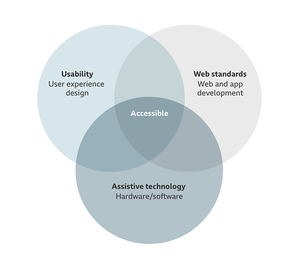
To deliver an inclusive experience, accessibility must be an integral part of the user experience design. It must also be integral to development and testing. Assistive technology (software or equipment such as screen readers or switch devices) can improve capabilities and bridge the gap for those with more severe impairments.
Note
This guideline is only an introduction to accessibility thinking.
For detailed guidance and further information on accessibility, please read the 大象传媒 mobile accessibility guidelines.
Getting started
If accessibility is not something you've had to consciously think about before, here are a few things to keep in mind.
Put people first
People are different. So are impairments. They may be cognitive, motor, hearing or vision related, or a combination of these. They may be temporary or long-term, mild or severe. And someone's experience with assistive technology can vary equally as much.
Aim for no impassable barriers to someone interacting with what we build.
Use familiarity
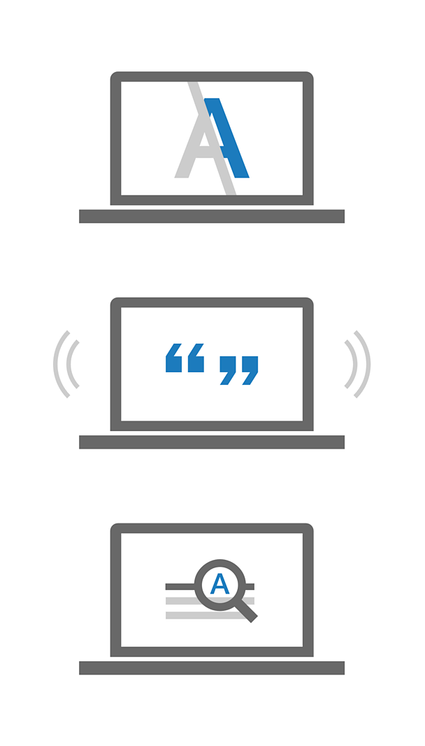
Where possible, use standard user interface elements and familiar design patterns, interactions, editorial, text equivalents and icons. This should be done across apps and sites, so that content and interactions quickly become familiar and recognisably 大象传媒.
For example, consistent labels and text equivalents used with an icon or logo across platforms will help people navigate confidently and reinforce meaning and brand.
Give control
Always give people control over content. It can help them understand what they are seeing and stops them becoming disoriented or lost. This also means not suppressing device features like the pinch zoom or forcing a specific orientation.
For example, this could be choosing between a grid or list layout, choosing to play or pause a news ticker, or opting in or out of an auto-play feature.
Offer choice
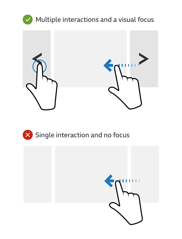
Give multiple ways to control interaction with components and show which component has focus. It is helpful for everyone to be able to see or hear that a component can be interacted with. Use visible focus, hover or touch states, and suitable labels or text for screen readers. This will make it easier for more people to complete tasks.
For example, providing a button style alternative to a gesture control enables people new to touch screens, and also those using a switch or screen reader.
Add value
All features add value for someone. However, prioritise features that add positive value for disabled people. These may be features that help quicker navigation and content discovery, or manage and show preferences better. You may find such features help everyone.
For example, adding a filter such as 'A-Z' or 'recently added' to a list of favourites, or improving the user journey to audio described or sign language content.
Key considerations
The following are some key considerations for designing a Minimum Viable User Experience (MVUX). While not comprehensive, they will help you be inclusive of a high percentage of users most of the time.
Think about headings, labels and link text
Consider how consistent they are across your design and other designs, and whether they make sense out of context. Some people use these to navigate and understand content. Relevant guidelines include headings, consistent labelling, descriptive links and alternatives for non-text content.
Think about focus
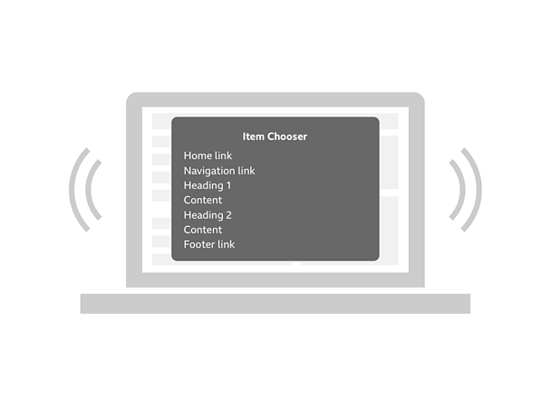
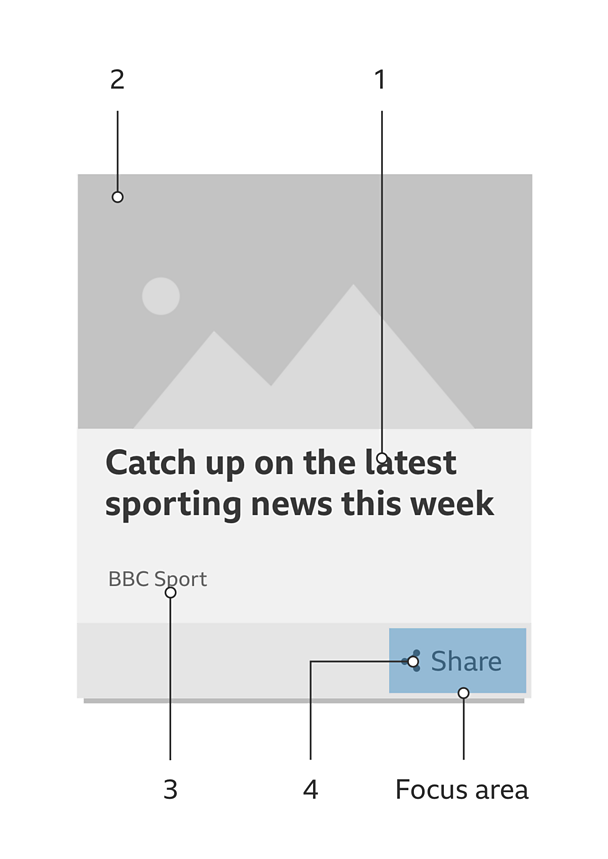
Consider the order in which it is received and how it's indicated. Not everyone uses a mouse. Relevant guidelines include focusable elements, content order, and keyboard trap.
Think about colour
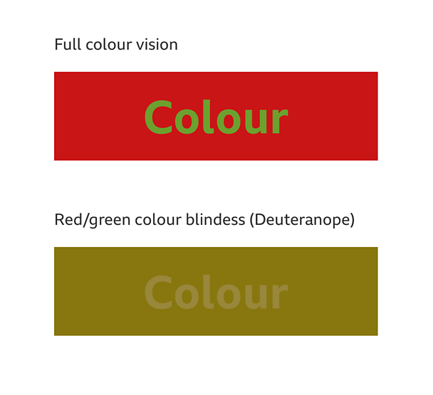
Consider how text colour contrasts against the colour behind it, and whether any meaning is implied by colour alone. Not everyone sees all colour. Relevant guidelines include colour contrast, colour and meaning, and actionable elements.
This is not everything. The 大象传媒 mobile accessibility guidelines provide more information. However, accessibility is already covered in the GEL guidelines for iconography, typography and touch.
Annotating wireframes and UX designs
How you convey accessibility considerations to product owners, developers and others in your team will depend on how you work. It is important that you do so.
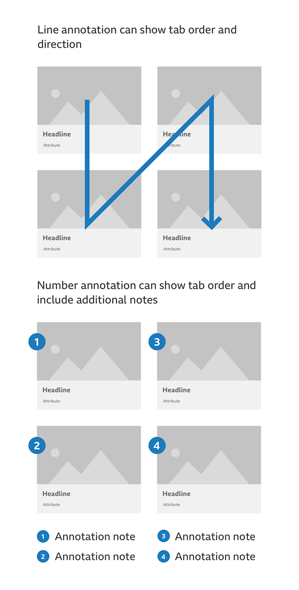
Annotating wireframes or UX designs and documents is one approach. It should always be clear what is annotation and what is design. You could combine a non-pallette colour with lines, arrows, numbering, overlap, or other techniques.
For example, a line and arrow could show tab order and direction. While numbered annotations could show tab order and more information and explanation if needed.
Whatever the approach, always make sure that others understand what accessibility features are included in the design and why they're there.
User testing
Even knowledgeable, well-advised designers may not get the best solution straight away. Don't make assumptions or hope things are OK. Always test your ideas and concepts with a broad range of people. This should include those with at least moderate cognitive, motor, hearing or vision impairments. Design researchers will be able to advise and help with testing.

