Overview
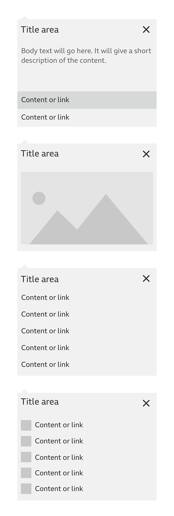
How it works
Follow these steps to see how the information panel works and what it's made up of.
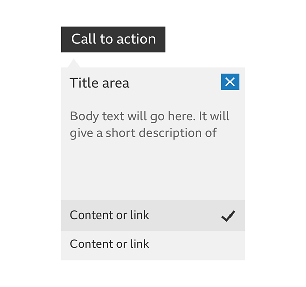
Call To Action (CTA): Selecting the CTA opens the information panel.
Information panel: This is a solid panel with a directional arrow pointing to the CTA.
Title, text, images, links: At the top of the container there's space for a title and close button. You can add text, images, icons and links to the panel.
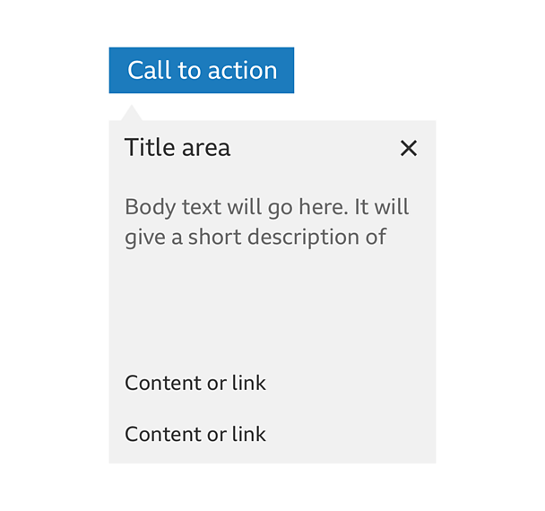
Hover state: Hovering on an interactive item starts the hover state. A coloured container shows the target area, the text can change colour to suit the container.
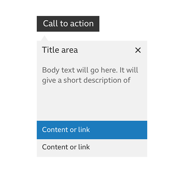
Selected state: Selecting an item can cause the container to change to a different colour and show a 'tick' icon.
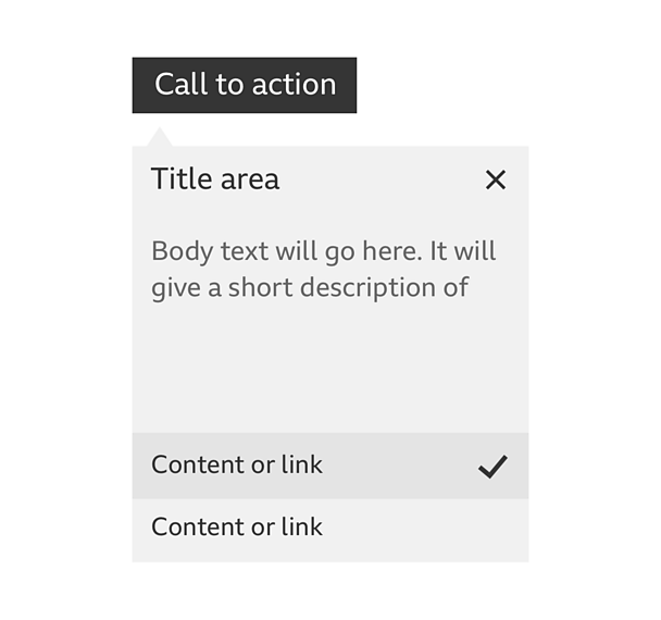
Close: You can close the information panel by selecting the 'close' button, the original CTA or selecting outside the panel.
Rules
- You can use the panel anywhere on the page but if you place it on the left, you need to align the left edge with the CTA.
- If you use it on the right, the panel sits to the left of the CTA and the directional arrow lines up with the centre of the first 44 pixels of the CTA.
- The panel itself doesn't have a fixed width.
- The panel colours can be changed but you need to make sure the hover and selected state colours are different. They should also contrast with the text correctly.
- The directional arrow of the information panel should always be centred with the first 44 pixels of the CTA.
- Never let the CTA be hidden by the panel when it's open.


