Please read the Licensing terms before you download this content.
Overview
Inputs are individual elements that can be combined together to design form experiences on the ´óĎó´«Ă˝, such as collecting information from users of our services or enabling people to participate with the ´óĎó´«Ă˝, like uploading content.
This guideline covers the individual inputs that can be used to build a form, to ensure maximum consistency and accessibility for our users.
Included are several types of text input, password input, date input and selection inputs, with more in development.
Want to know how to design forms?
If you're looking for guidance on designing a complete form experience, including deciding on which data to ask for and structuring a form, please visit How to design forms.
Text inputs
A text input field allows a user to type information freely. Text inputs can include labels to help the user identify what type of information is needed, and hint text if it helps. Labels and hint text should remain visible to the user throughout the experience.
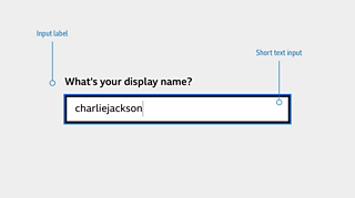
Short text input
Should be used for short amounts of information such as name, display name or email address
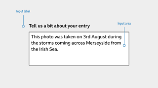
Text area
Also known as long text input. It should be used for longer amounts of information where multiple lines might be needed.
Recommendations
Use fixed width text inputs for information that has a commonly understood length, such as post codes. This helps users understand what they should enter.
On touch devices, support the numerical keyboard for inputs that require numbers and the email-specific keyboard for inputs that require email addresses or websites, to reduce effort for all users.
💡Why? → When using mobile devices, participants stated they would have preferred the number keyboard to show, so that they couldn't accidentally add characters.
- So that our inputs can be used by everyone, use a distinct visual container which suitably contrasts with the background, so that a user can clearly see where to interact with the input.
💡 Why? → Text fields weren't immediately clear to participants when a design didn't closely resemble a standard input box, causing people to hesitate before interacting with them.
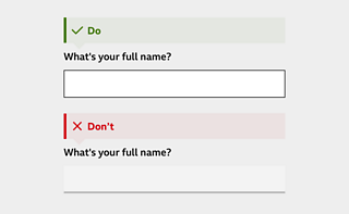
- Use clear and succinct labels for your inputs to help users identify meaning and feel confident in their response. These should be positioned above the input field. See our Writing section for more on writing labels.
💡 Why? → When asked to type in their name, all children responded with just their first name. Most adults entered their full name. Be specific with what's required, like labelling your input with "Full Name".
Personal data inputs
Password
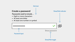
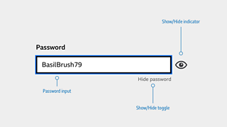
The password input is based on the short text input, but allows the user to securely enter a password or create one.
Recommendations
Show the password requirements and make sure the user can see them before interacting, to reduce friction when creating a password.
Allow the user to see the password they are typing by including a "show password" text toggle, to minimise the risk of mistakes. Making the password visible should be opt-in as a user might be in a public space. Note - this feature should not be visible to screenreader users. The text toggle can be supported with a view-on/view-off icon.
Green 'confirm' icons can be used as a validation method when users are creating a password for the first time, but should not be used as validation for subsequent sign-ins, as users can interpret this as their password being correct. Use the "show password" function for subsequent password entries instead.
Passwords that don't meet the criteria should use error messaging to help the user correct their input.
Date
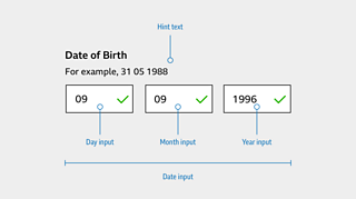
Date is a series of three short text inputs, together requiring a single date input from the user. It should be used to allow users to enter a memorable date, such as a date of birth.
Recommendations
- On touch devices, enable the numerical keyboard to save users time and help them understand that a numerical date format is needed.
💡Why? → When using mobile devices, participants stated they would have preferred the number keyboard to show, so that they couldn't accidentally add characters.
- Label each input clearly to avoid confusion.
💡 Why? → One participant tried to add slashes into the text inputs when they were shown DD/MM/YYYY as an input label. Present examples exactly as they should appear - DD MM YYYY in this case. See our guidance on writing for inputs below.
- Avoid auto-advancing users to the next input box as this can disorientate them. The user should always be in control.
Email input is a text input that allows a user to specifically enter an email address.
Recommendations
On touch devices, enable the symbol keyboard to help users quickly and easily enter their email address. This might include shortcuts such as @, .com, .co.uk
Label the input clearly to show users what's required of them.
💡 Insight → Children (under 11) are unlikely to know what the format of an email address is.
Selection inputs
Selection inputs include checkboxes, radio buttons and dropdown selectors - requiring the user to make a selection or confirm something.
Coming soon
More selection inputs, including Toggle, are coming soon.
Checkbox
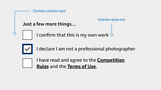
Use a checkbox in these scenarios:
- When a user can or must select multiple options in a list
- When a user can turn something on or off
- When a user can opt in or out of something
- When a user needs to go through some more steps before changes are made, like pressing 'Save'.
Radio button
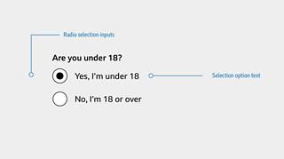
Use a radio button when one choice needs to be made between mutually exclusive options, such as choosing between Yes and No.
Dropdown
Use a dropdown when one choice needs to be made from a long list of mutually exclusive options, such as choosing between regions of a country. If multiple selections need to be made, use Checkbox instead.
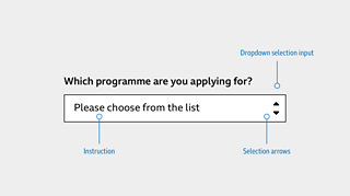
Dropdown inputs should use the browser or device's native selector experience from the point of interaction. Users will be more familiar with this than requiring them to relearn a new interaction.
States of interaction
Default
This will be how the input appears before the user has interacted with it.
Hover
This will be how the input appears when a user moves their cursor over it. This does not apply to touch devices or TV.
Focus
This will be how the input appears whilst a user is interacting with it, whether they are using a touch device, tabbing with a keyboard or switch device, or using a mouse.
Always show the cursor when an input field is focused. It shows the user's current position.
Filled
This will be how the input appears after a user has interacted with it, whether they are using a touch device, tabbing with a keyboard or switch device, or using a mouse.
Error
This will be how the input appears when something has gone wrong and the user cannot continue. It should be accompanied by an Error Message. Wait until a user has stopped typing before raising an Error Message, as this can be frustrating and disabling.
Insight đź’ˇ Premature error messaging can confuse users if they already know what they need to do. Some users may be slower to type. During research, some participants saw the error message appear momentarily as they completed the box, which caused confusion.
Writing for inputs
When writing for inputs:
- be clear and concise
- use plain English
- avoid jargon and regional language
- use sentence case (not title case)
- avoid ampersands (&) and abbreviations (e.g., i.e.)
Labels
For name fields, use:
- First name
- Last name
- Full name (if you're using only one label)
For contact detail labels, use:
- Contact number (not mobile or telephone)
- Email (not e-mail or email address)
- Username
For date of birth labels, use:
- Date of birth
- Day
- Month
- Year
Hint text
Use hint text if:
- errors are common (for example, formatting problems)
- additional context or information is needed
Avoid hint text if:
- there is no additional value to the user
- you are repeating information in the title
When writing hint text:
- be action-focused
- be concise
- keep the tone of voice direct to reduce mental load
Error Messages
When writing error messages:
- be as precise about the error as possible
- use clear language and a human tone of voice
- if the reason for the error is unclear, follow a problem-solution format (for example Sorry, it looks like something's not working right now. Please try again in a few minutes)
- if there is a solution, take a problem-only format (for example sorry, that password's too long)
Accessibility
Make it easy
- Consider a logical tabbing order for keyboard and assistive technology users.
- Users should always be in control. Changing focus automatically can be disorientating.
Make it obvious
- Label all form controls so users know what information to provide. They should always be visible and available to assistive technology.
- Place labels above the input field. This is particularly important for screen magnifier users. Assistive technology should also read the label before the input, especially important if a user is about to interact with a dropdown selection input.
Visual considerations
On top of what has already been highlighted throughout this guideline, a consistent type hierarchy should be maintained. The following GEL type classes should be used for GEL inputs in form experiences.
- Labels should use GEL Pica
- Input fields should use GEL Pica
- Hint text should use GEL Brevier
- Error messages should use GEL Brevier
All text should contrast well with the background and interactive elements should be visually distinct from a page's background.
See our .
Inputs in action
Inputs are currently being used for participation on C´óĎó´«Ă˝.
Where next?
How to design a form
This guideline will give an overview of what to consider when designing forms and asking users for data.
Including recommended markup, layout and behaviour.
Typography
This guideline explains how to use typography across ´óĎó´«Ă˝ online. It covers guidance on ´óĎó´«Ă˝ Reith, and for teams still using Helvetica.
Licensing
These assets are available for download on the following licence terms:
You can:
- Download the assets and use them free of charge;
- Use the assets without attribution; and
- Modify or alter the assets and edit them as you like.
You can't:
- Use the assets in a way that would bring the ´óĎó´«Ă˝ into disrepute;
- Make available the assets so that they can be downloaded by others;
- Sell the assets to other people or package the assets with others that are for sale;
- Take payment from others to access the assets (including putting them behind a paywall);
- Use the assets as part of a service that you are charging money for; or
- Imply association with or endorsement from the ´óĎó´«Ă˝ by using the assets.
Disclaimer: The assets are offered as is and the ´óĎó´«Ă˝ is not responsible for anything that happens if you use them.


