Overview

How it works
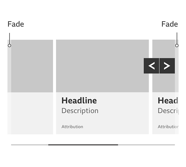
The carousel is made up of a scrollbar, arrow buttons, fading edges and a number of containers of content.
When you scroll to the end of the carousel it stops. It doesn't loop and start again.
The carousel is responsive, with the width varying from 320 pixels up to 1280 pixels, in line with the GEL grid.
Navigation methods
You can move through the carousel using the left and right buttons, the scroll wheel on your mouse and by swiping.
The scroll wheel on your mouse
Scrolling left or right with your mouse wheel anywhere in the carousel moves it from side to side.

Swiping on touch devices
Swiping left or right anywhere in the carousel moves it from side to side.
Remember, when you scroll to the end of the carousel it stops. It doesn't loop and start again.
'Left' and 'right' buttons
Select either of these buttons and the content slides along to the next set. This continues until you reach the end of the carousel.
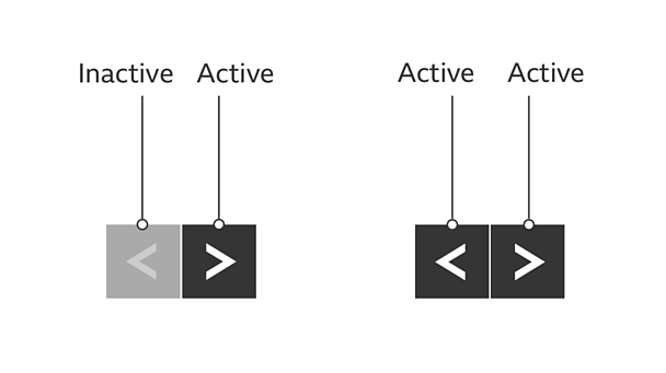
At the left end of the carousel, the left button changes to a faded, inactive state. At the right end of the carousel, the right button becomes inactive.
The buttons should also appear differently when they're being used to show they've been selected.
Buttons should be clearly visible in contrast to content they're positioned against. Ways of making buttons visible could include using a contrasting colour or using a glow (or shadow) that contrasts with the button colour.
Buttons are helpful for users who are less familiar with swipe actions, or who navigate by keyboard or switch. Swipe will need a double finger swipe when a screen reader is enabled.

Fade
The content fades out at the edges of the carousel. This shows there's more content hidden to the left or right of the carousel. This is clearest on screens wider that 1280 pixels where there's more room to see the faded content.

Scrollbar
The scrollbar has two elements (the 'highlight' and the 'rail') and two purposes:
- It shows how much content there is in the carousel. If the highlight takes up a large part of the rail, there isn't much content. But if it takes up a small part of the rail, there's a lot of content.
- The highlight shows where you are in the context of the whole carousel.
- The scrollbar is optional and does not need to be included unless required.
Rules
Colour
Make sure there's a good contrast between the content, controls, scrollbar and carousel background, so the content outline is clear.
Content size
Content items are a fixed width at all breakpoints. They don't grow or shrink depending on the browser width.
Hover and focus states
The carousel buttons should look noticeably different in their hover state. You can achieve this by swapping the colours of the block and arrow elements.
If the content inside the carousel links elsewhere, it should have a clear hover state too.
Carousel buttons and content with a link should also have a clear focus state. This is so people using a keyboard to navigate can tell when an arrow or piece of content is selected (the hover and focus states can look the same).
Variations
How much content?
The carousel can have a varying number of pieces of content. Just be careful not to use so little content that the carousel is unnecessary, or so much that it becomes difficult to navigate. If you have a very large or small amount of content, a carousel may not be the best solution.
Controls and scroll colours
You can use different coloured controls and scrollbars. We often use a product brand colour for the scrollbar highlight or control hover state, but this isn't mandatory.
Further reading
For more information including a reference implementation and recommended behaviours visit the


