Please read the Licensing terms before you download this content.
Overview

How it works
There are four categories of messages in apps:
Confirmation
These are messages that appear after you take an action in the app. They confirm that the action was successful or that you need to take further steps in order to complete your task.
The tone of voice used should be friendly, not imposing and keep it short. Each product can adapt the tone of voice to suit their audience.
We have two types of confirmation messages:
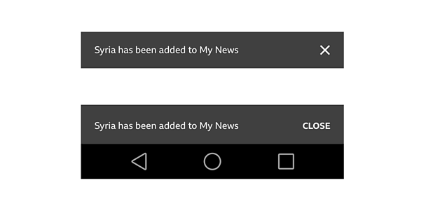
Confirmation without actions
Displayed to confirm that the action you've taken is completed. It does not require any further decisions to be taken
For example:
'Oscars 2016 has been added to My News'
'You are now signed in'
Confirmation with actions
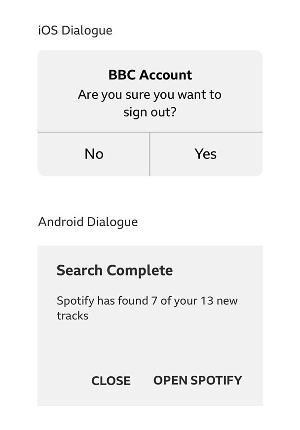
These require a further decision to be made, in order for you to complete the action successfully.
For example:
'Search completed, we've found 12/12 tracks. Listen to them in Spotify?'
Interruptions
These are messages that interrupt you while using the app. They are displayed for three reasons:
- To highlight that something new is available in the app. We commonly use a full screen upsell for this.
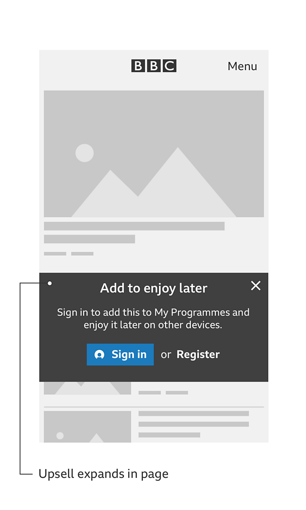
- To let you know about a feature, in context with what you are doing. For this we'd recommend a contextual upsell during the journey.
- To highlight the benefits of underused features in the app and how to use them (i.e hints and tips).
Full screen upsell
The full screen upsell, can appear during onboarding into your app or while using the app, but is not contextual with what you are doing in the app.
Contextual upsell during the journey
Contextual upsells prompt you to try the functionality in context, either if you are signed in or signed out.
Hints and tips
Hints and tips appear when a feature is not used for some time or is not used at all. These messages could be single messages or step by step hints that take you on a journey. Make sure they are contextual to the area of the UI that requires explanation.

Error messages
These are messages to inform you that something went wrong. They affect or block your experience within the app.
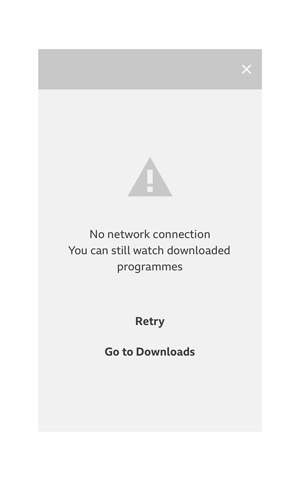
If the app content is cached and still available you don't need to use a blocking type message, a less intrusive message will suffice. However if your content is not available you should use a full screen error message.
The tone of voice of an error message is apologetic and should reassure that you are not at fault. The cause of the error (if known) should be explained and a solution offered.
An alternative journey should be highlighted if available. For example, the iPlayer 'no network error' screen displays a Call To Action (CTA) to go to downloaded programmes.
There are two types of error messages:
Action errors
These messages inform you that an error has happened immediately after an action and that you can't complete the action.
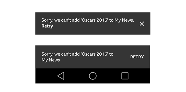
System errors
These messages appear in the app when the error occurs. They explain the cause of the error (if known) and aim to help you to solve it (if possible).
Examples of system errors:
Generic error
Something went wrong but we don't know the cause.
E.g. 'Sorry, something has gone wrong. Please try again later'
Content error
Can't receive the content and we know the type of content.
E.g. 'Sorry, we were unable to retrieve the latest news stories for this page'
No network error
The connection not available or the user is offline.
E.g. 'No network connection. Please check your connection and try again'
App availability
The app is not supported or is no longer available.
E.g. 'An upgrade is available for this app'
Rules
Confirmation without actions
- Use a custom design for iOS and a native snackbar for Android
- Position either on the top or bottom of the screen
- Fade message out after 3 seconds
- Always provide a dismiss action
Confirmation with actions
- Use native dialogs for both iOS and Android
- Always provide a core action to continue the journey
- Always provide a dismiss action
Error messages
- For a less intrusive error use a custom design for iOS and a native snackbar for Android
- Always provide a dismiss action for a less intrusive error message
- The less intrusive error messages shouldn't fade out until the error is resolved or the user dismisses them
- Provide a 'retry' option in case of error after an action (see 'action' errors above)
Variations
There are a variety of message types to choose from as detailed above. Each lending itself more to certain scenarios that might occur in your app. We've put together a handy decision flow diagram to help you decide which message to use.
Please download the downloadable assets pack at the top of this guide.
Licensing
These assets are available for download on the following licence terms:
You can:
- Download the assets and use them free of charge;
- Use the assets without attribution; and
- Modify or alter the assets and edit them as you like.
You can't:
- Use the assets in a way that would bring the ´óĎó´«Ă˝ into disrepute;
- Make available the assets so that they can be downloaded by others;
- Sell the assets to other people or package the assets with others that are for sale;
- Take payment from others to access the assets (including putting them behind a paywall);
- Use the assets as part of a service that you are charging money for; or
- Imply association with or endorsement from the ´óĎó´«Ă˝ by using the assets.
Disclaimer: The assets are offered as is and the ´óĎó´«Ă˝ is not responsible for anything that happens if you use them.


