Please read the Licensing terms before you download this content.
Overview

How it works
Our content utilities are currently 'add' and 'share'.
Add
This allows you to show an interest in something on the ´óĎó´«Ă˝ and get more from doing so.
The two key examples are:
- Adding a topic, brand or concept in order to get new and relevant content in the future
- Adding a piece of content to a personal space in order to get back to it later
Share
This allows you to easily share a piece of content through your social network of choice.
Recommendations feedback
These provide a way for you to give feedback on your personalised recommendations. Your feedback will make the recommendations you receive more accurate and relevant.
For more details view the recommendations feedback guideline.
Toggles and buttons
Content utilities can either be a toggle or a button.
Toggle
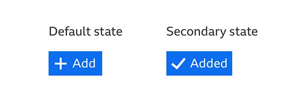
A toggle has two main states, 'default' and 'selected'. These states are opposite to one another and clicking the toggle will change between the two. Add uses a toggle. Clicking a button will 'add' a piece of content and clicking it again will remove the same piece of content.
Button
A button can be used when the action affects the current view.
For example:
- Clicking a button makes some related content appear or disappear
- For actions that don't have states, like 'share'
Note
Remember, it's important that we don't take people away from the content they're interacting with at that moment.
Additional steps
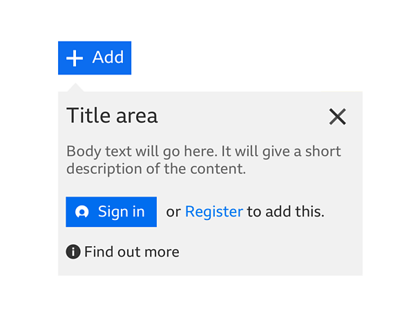
You might need to ask people to perform an extra step before the action is completed. They should not have to interact with it if they don't want to. In this case the action would not be completed.
Note
Use a pattern that doesn't stop people from browsing the rest of the page. For example, the information panel pattern.
For example:
- Someone is signed out and they need to be signed in to use the feature
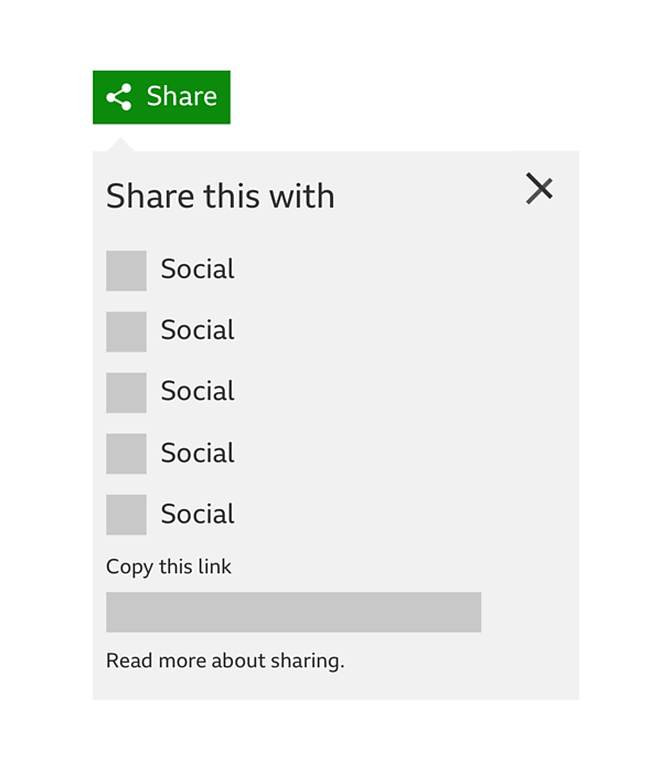
- You need to select a social network to share to
- The action impacts on your data. For example, removing an item from a personalised space. If this happens, you may need to be shown a confirmation step before removing the item.
Confirmation messages
If necessary, an information panel should be used to show that the action was successful or that something went wrong.
Make sure that:
- You give people an onward journey. For example a link to the page where the content was added or how to solve an error (if possible).
- The panel closes after 10 seconds or until you click on the 'close' button or elsewhere.
- Designers can choose when to show a confirmation message. However, we recommend showing one when people use a content utility in your product for the first few times or if they haven't used it in a while.
Where can content utilities be placed?
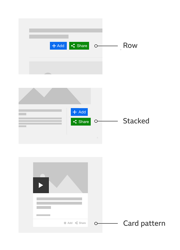
Place them in a way people can clearly understand which piece of content they relate to. If they're going to be part of another pattern, such as cards, then follow the positioning rules for that pattern.
Rules
Core elements
For buttons with the same functionality, the icon, label and colour should always be the same across any page.
The size of the container and where it's placed will determine how much of the button is visible. You can choose between a fixed width across all breakpoints or a progressive reveal.
The icon-only variant should only be used if you have space constraints, as this might have an impact on quickly understanding the functionality.
Designers can choose to include a number count. It can be used on any size of button or toggle and should display the number of people that have performed the action.
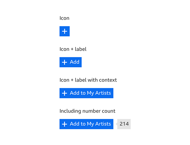
The order that the buttons appear is up to the product that uses them. That order should be based around the context and need of the experience. It's also up to the product to decide how best to present the buttons. For example: inside a box or not, stacked or in a row, or a single icon with text.
Sometimes, buttons will be placed on a site that has distinctive branding, like C´óĎó´«Ă˝ or Cbeebies. Those buttons should assume the style of those pages but remain consistent in terms of the core elements.
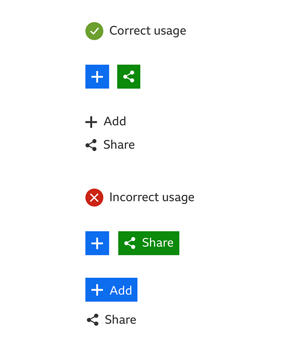
When used together the buttons should:
- Have the same size
- Match the style and variant
Variations
Button sizes and proportions
The icon size depends on the typeface size at the different breakpoints. The button background height should always align with grid guideline. The icon and text elements should then all be centered on the button background.
Responsive behaviour
Look at typography guideline for type sizes and our downloadable assets for a set of ready-made buttons.
Colour palettes
You will find examples of these palettes in our downloadable assets at the top of the page:
Button/toggle colour palettes
There are three styles of button and toggle. We've called them 'regular', 'light' and 'dark'. In order to make content utilities consistent and easily recognisable, we recommend using the 'regular' style. If that doesn't work in your product, you can use the 'light' or 'dark' styles.
Information panel colour palettes
When using an information panel with content utilities, choose the 'light' or 'dark' styles. This will depend on what works better with your needs.
Share icon on native apps
Native apps on iOS and Android do not use the GEL 'share' icon. They use the native icon for the relevant version of operating system.
Android apps use the . iOS apps use the .
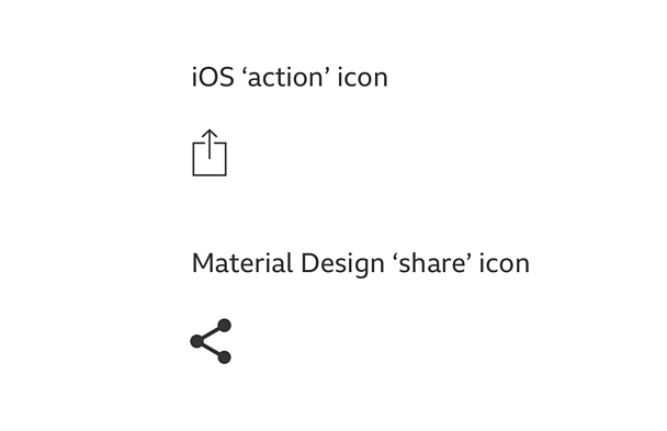
Upon tapping these buttons, both iOS and Android will then show the share options available based on what apps have been downloaded. On iOS you will also get a row of actions available based on what data is available from you content you want to share (E.g. 'add to reading list' and 'copy').
iOS uses the and Android uses the to display the options available.
Pattern in action
This pattern is currently being used by ´óĎó´«Ă˝ iPlayer, ´óĎó´«Ă˝ Sport, C´óĎó´«Ă˝, and the ´óĎó´«Ă˝+ app, available here:
/
Licensing
These assets are available for download on the following licence terms:
You can:
- Download the assets and use them free of charge;
- Use the assets without attribution; and
- Modify or alter the assets and edit them as you like.
You can't:
- Use the assets in a way that would bring the ´óĎó´«Ă˝ into disrepute;
- Make available the assets so that they can be downloaded by others;
- Sell the assets to other people or package the assets with others that are for sale;
- Take payment from others to access the assets (including putting them behind a paywall);
- Use the assets as part of a service that you are charging money for; or
- Imply association with or endorsement from the ´óĎó´«Ă˝ by using the assets.
Disclaimer: The assets are offered as is and the ´óĎó´«Ă˝ is not responsible for anything that happens if you use them.


